Classic and Card layouts
Classic and Card layouts
Applies to: anota, all plans Roles required: Editor or above (to create and edit forms) Regulatory references: none
Overview
anota shows a form to respondents in one of two layouts. Classic is a web page: the respondent scrolls through the fields, and a longer form can be split into pages. Card shows one question at a time on a full-screen card, and the respondent moves on card by card. You pick the layout when you create the form.
This page shows how to create a Card form, build it in the Card editor, and what respondents see in each layout. The examples are two Café Aurora forms: a short Quick Coffee Poll (Card) and the Barista Workshop Registration (Classic) from Getting started.
Key concepts
- Classic: a scrolling page with the company name and form title at the top. Fields can sit side by side (Width in Field types), and + Add page splits the form into pages that the respondent moves through with Next and Back.
- Card: each card is one page of the form. Every field you add gets its own card, so respondents answer one question per screen.
- Welcome card: a first card that holds only display elements, such as a Heading. It shows how many questions the form has and a Start button. The editor labels it Welcome card.
- Statement card: a card later in the form that holds only display elements. It shows a Continue button. The editor labels it Statement card.
- Progress bar: a bar that shows how far the respondent has got. It appears when the form has more than one page (Classic) or card (Card).
- The layout is fixed: a form keeps the layout it was created with. See Can I change a form's layout later?.
When to use each layout
- Use Classic when the form is long, when related fields should sit side by side or be grouped into a few pages, or when respondents benefit from seeing all the questions at once (registrations, orders, applications).
- Use Card when the form is short and you want a focused, one-question-at-a-time experience (quick polls, satisfaction surveys, feedback after a visit).
Task 1 — Choose the layout when you create a form
Prerequisites
- A role of Editor or above in the workspace (see Roles and permissions).
Step-by-step
Open Forms in the top menu. Click Create form for a Classic form, or Create card form for a Card form. Here, Café Aurora wants a quick poll, so click Create card form.
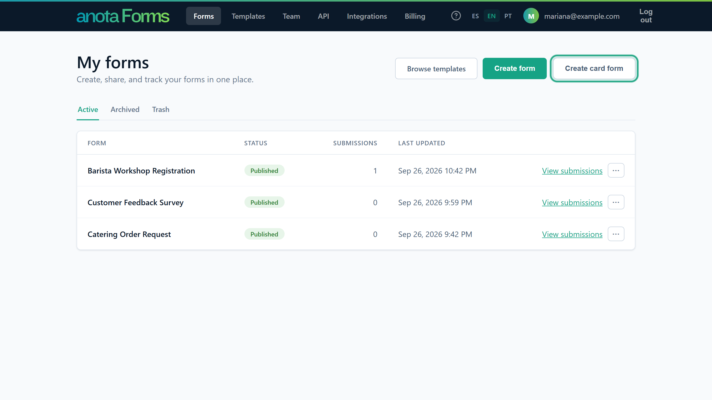 The two create buttons decide the layout: Create form is Classic, Create card form is Card.
The editor opens with a blank form called Untitled form. Instead of a page, a Card form shows a single empty card with Add a field with the + button. On the left is the card list (one numbered button per card, and + to add a card); under the card are ← Previous, the card counter and Next →.
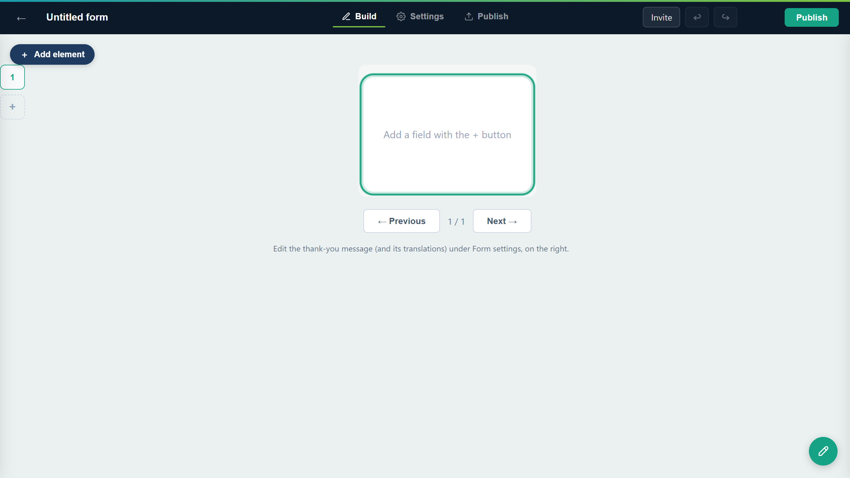 A new Card form starts with one empty card.
Result
You have a new, private draft in the layout you chose. Forms created from a template use the Classic layout.
Task 2 — Build a Card form
Step-by-step
Click the title at the top left and type a name (here, Quick Coffee Poll). Then click + Add element and choose the first element. To open the form with a welcome screen, start with a Heading.
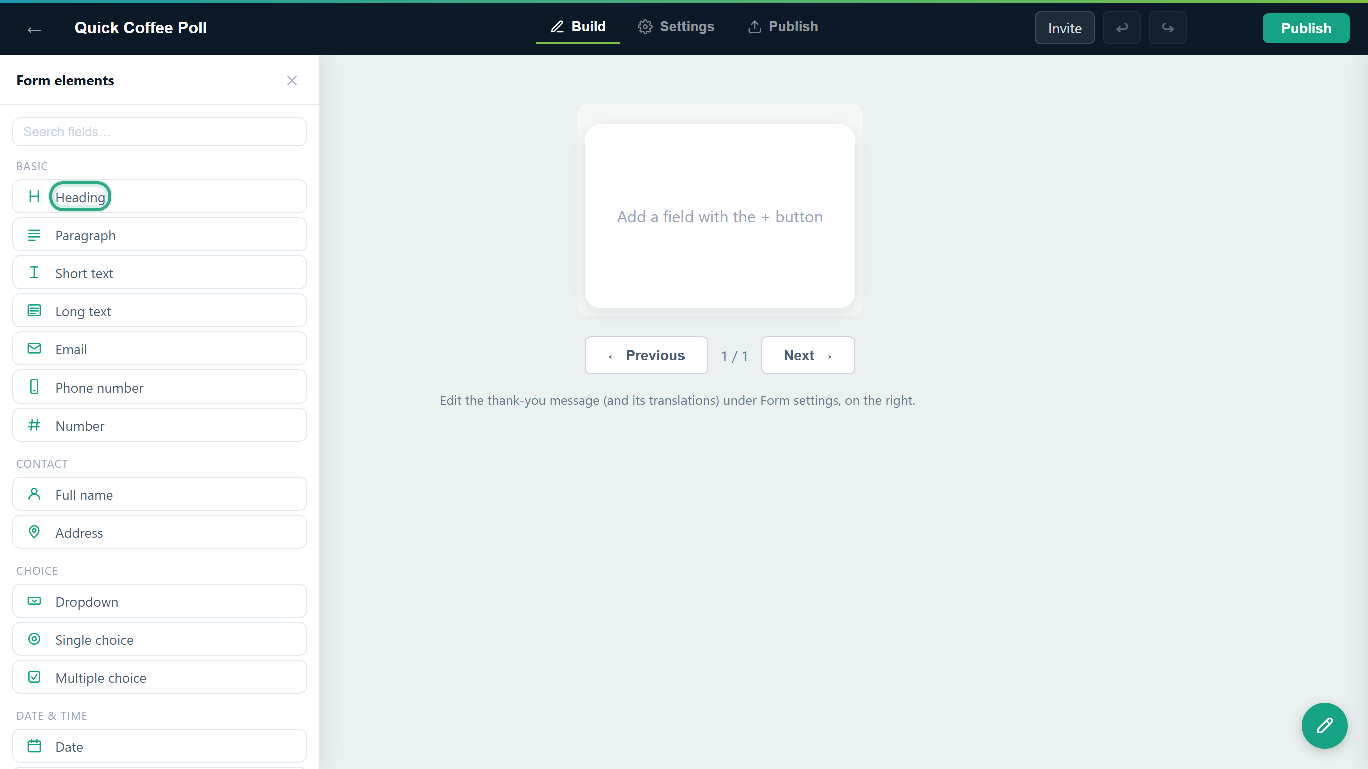 A Heading on the first card turns it into a welcome card.
The heading lands on the empty first card, and the Properties panel opens on the right by itself. (In a Card form, clicking a field on the card always opens its properties; there is no column of field buttons as in Classic.) Under Content, type the Label (the heading text) and a Help text under it. The editor now labels this card Welcome card.
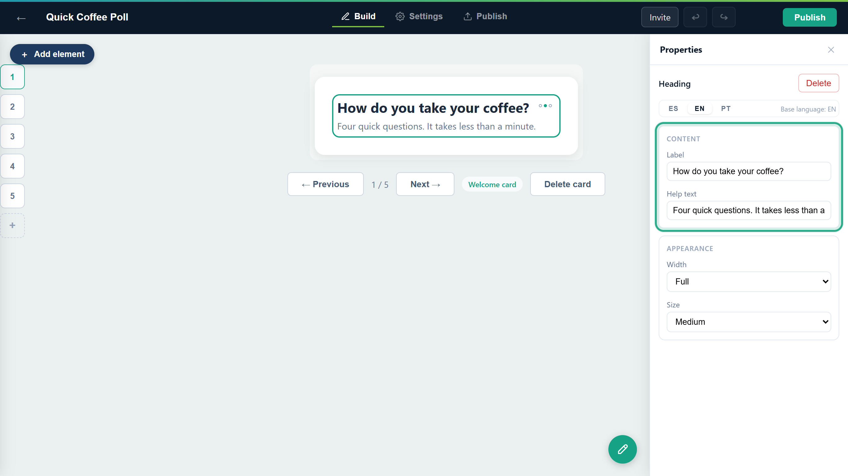 The first card holds only a heading, so respondents will see it as a welcome card.
Click + Add element again and choose Single choice. Because the current card isn't empty, anota adds a new card at the end for it, card 2, and opens it. Set its Label (What's your favourite drink?), replace the Options (use + Add option for more) and tick Required.
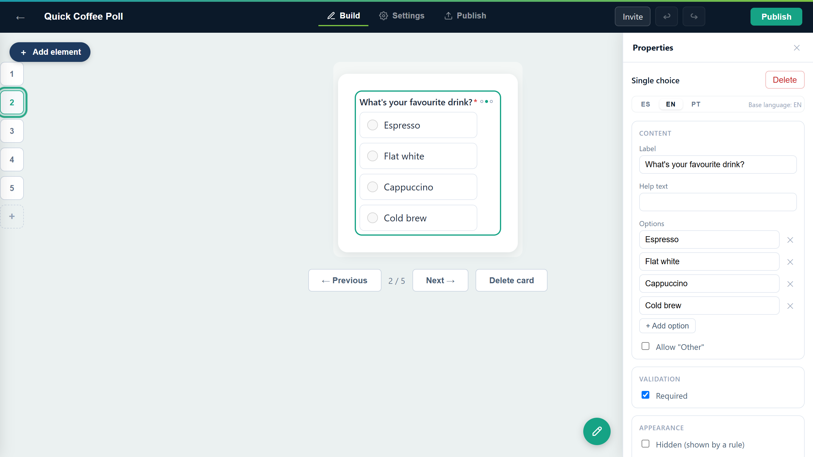 Each field you add gets a card of its own.
Add the rest of the questions the same way. For the poll: a Dropdown How do you like your milk? (Whole milk, Oat milk, Almond milk, No milk, thanks; Required), a Rating How would you rate your last coffee with us? (Required) and a Long text Anything else you would like to tell us? (optional). Every one gets its own card, and the card list on the left grows to 1 to 5. Click a number to open that card; + at the bottom of the list adds an empty card at the end, which the next field you pick fills.
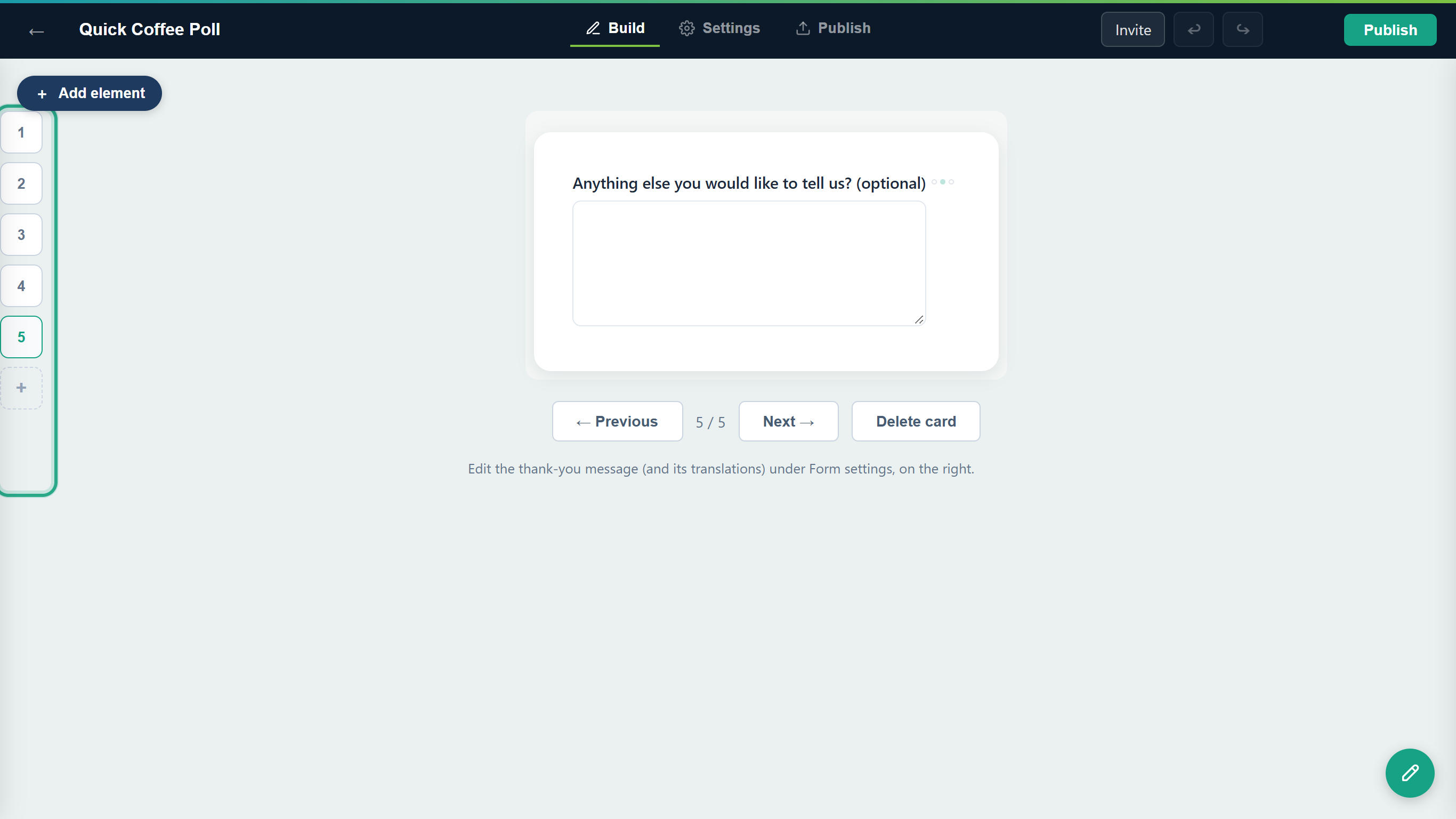 The card list shows every card in order. Card 5 is the optional comment.
Use ← Previous and Next → to step through the cards; the counter between them shows where you are (here 3 / 5). Delete card removes the card you're looking at, with its field (it appears once the form has more than one card). On the last card, a note reminds you that the thank-you message is edited in the form settings.
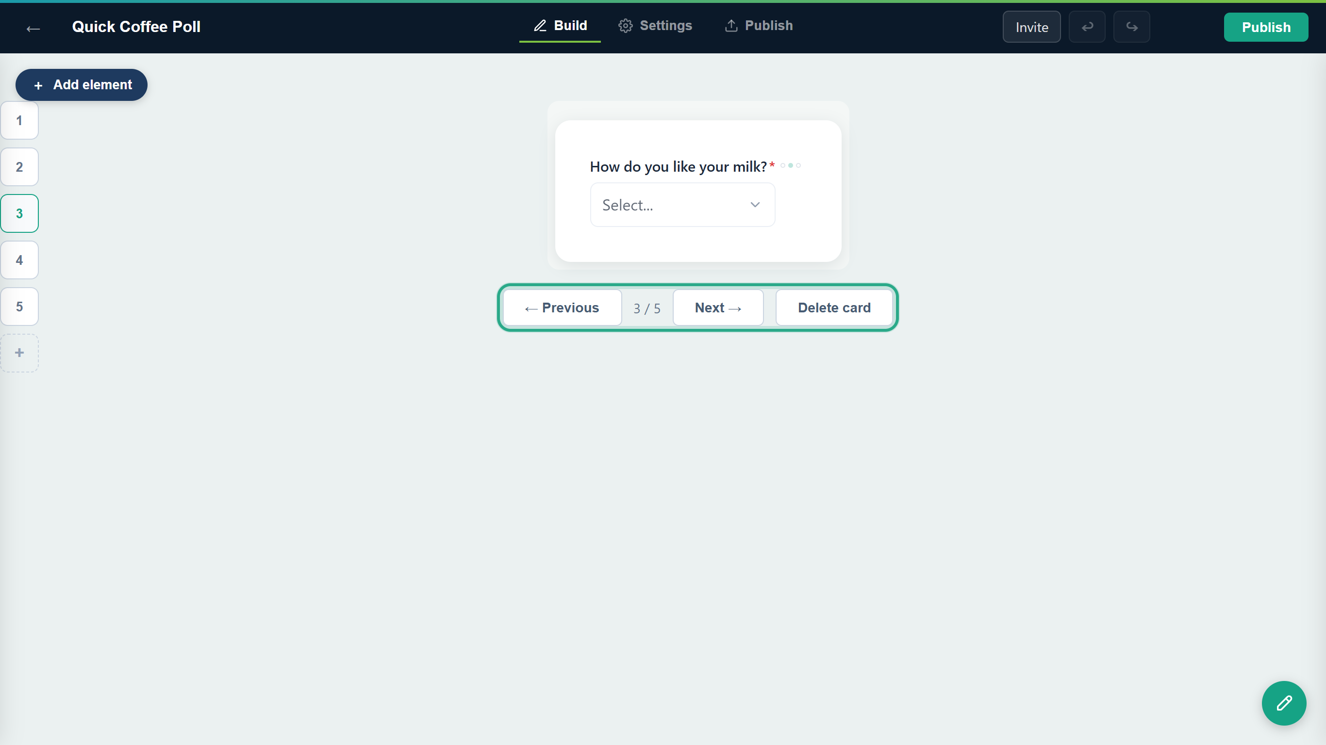 Move between cards, or delete the current one.
Undo: a card deleted by mistake comes back with ↩ Undo in the top bar. On a form that is already published, anota asks before deleting a card that holds published fields.
The builder saves as you go: the top bar shows Unsaved changes while an edit is waiting to be saved, then Saved. When the cards look right, click Publish.
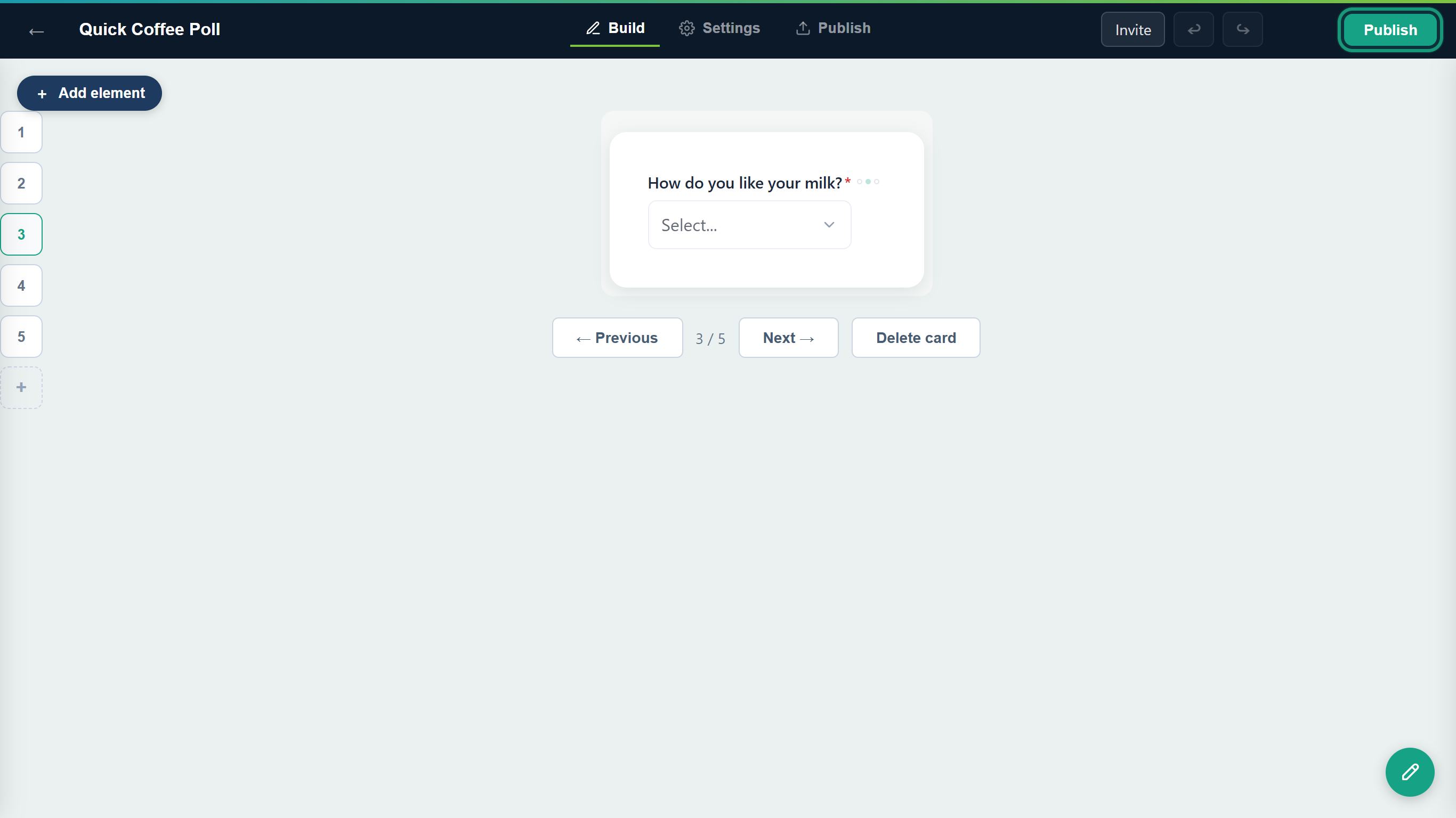 Publish the poll to get its public link.
Result
The Quick Coffee Poll is live, with a welcome card and four question cards. anota opens the Publish tab with the public link (here …/f/tecolotl/quick-coffee-poll) and the ways to share it; see Publish and share.
Task 3 — See a Card form as a respondent
Step-by-step
The respondent opens the link and sees the welcome card, full screen on the theme background. It shows the heading, its help text, the number of questions (4 questions) and a full-width Start button. At the bottom are the position marker (1 of 5) on the left and two arrow buttons on the right.
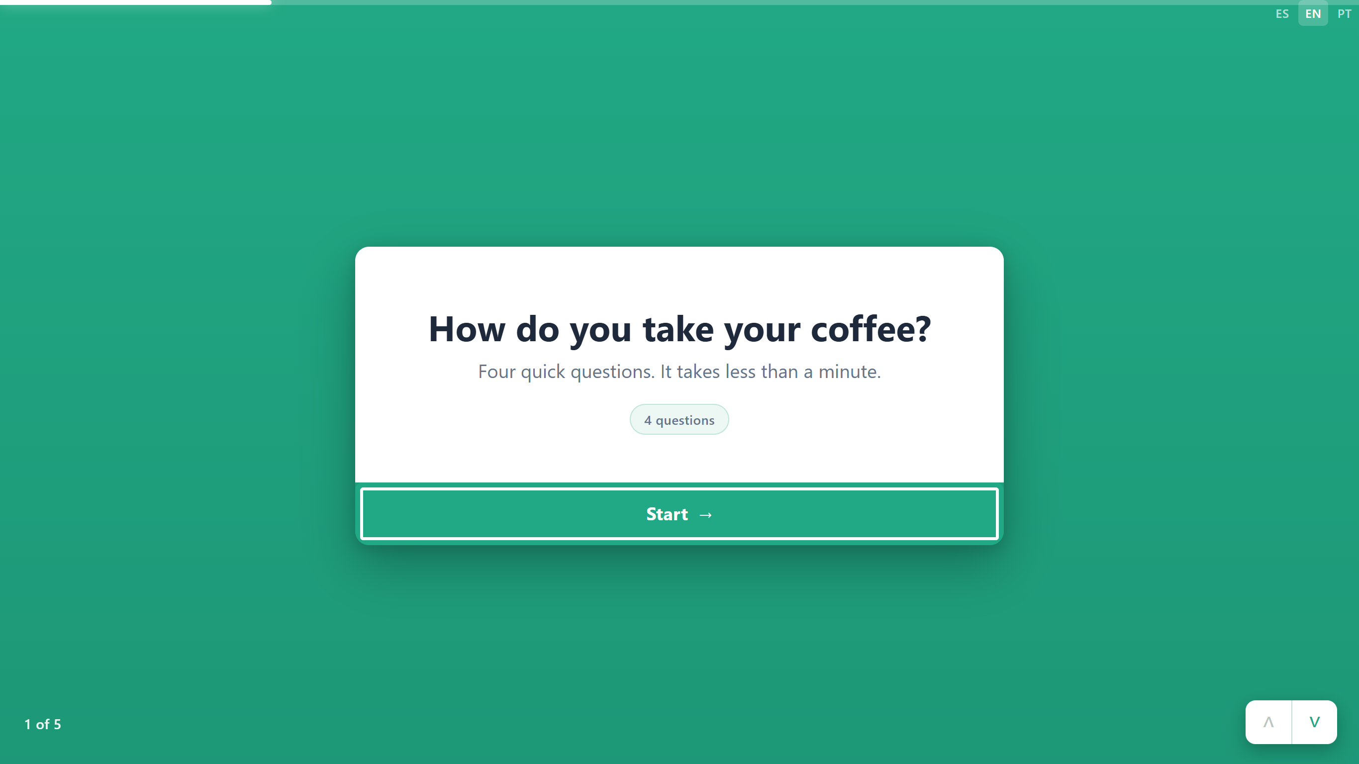 The welcome card. Start opens the first question.
Each question card shows its question number (1 →), the question and the answers. The progress bar across the top of the screen fills as the respondent goes. After answering, they click Next at the bottom of the card.
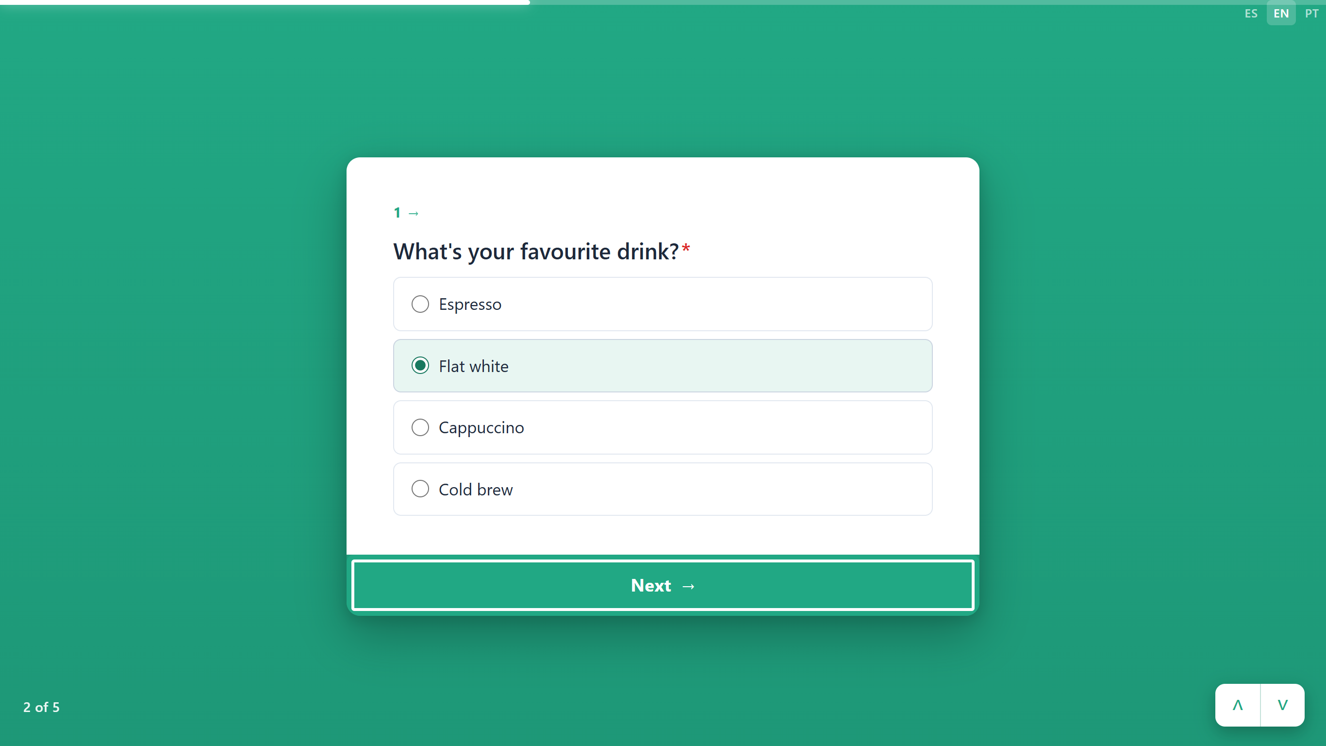 One question per screen. Next moves to the following card.
The arrow buttons in the bottom-right corner do the same as the buttons on the card: ∨ (Next card) moves forward, ∧ (Previous card) goes back one card. There is no swipe gesture; on a phone, respondents also use the button or the arrows.
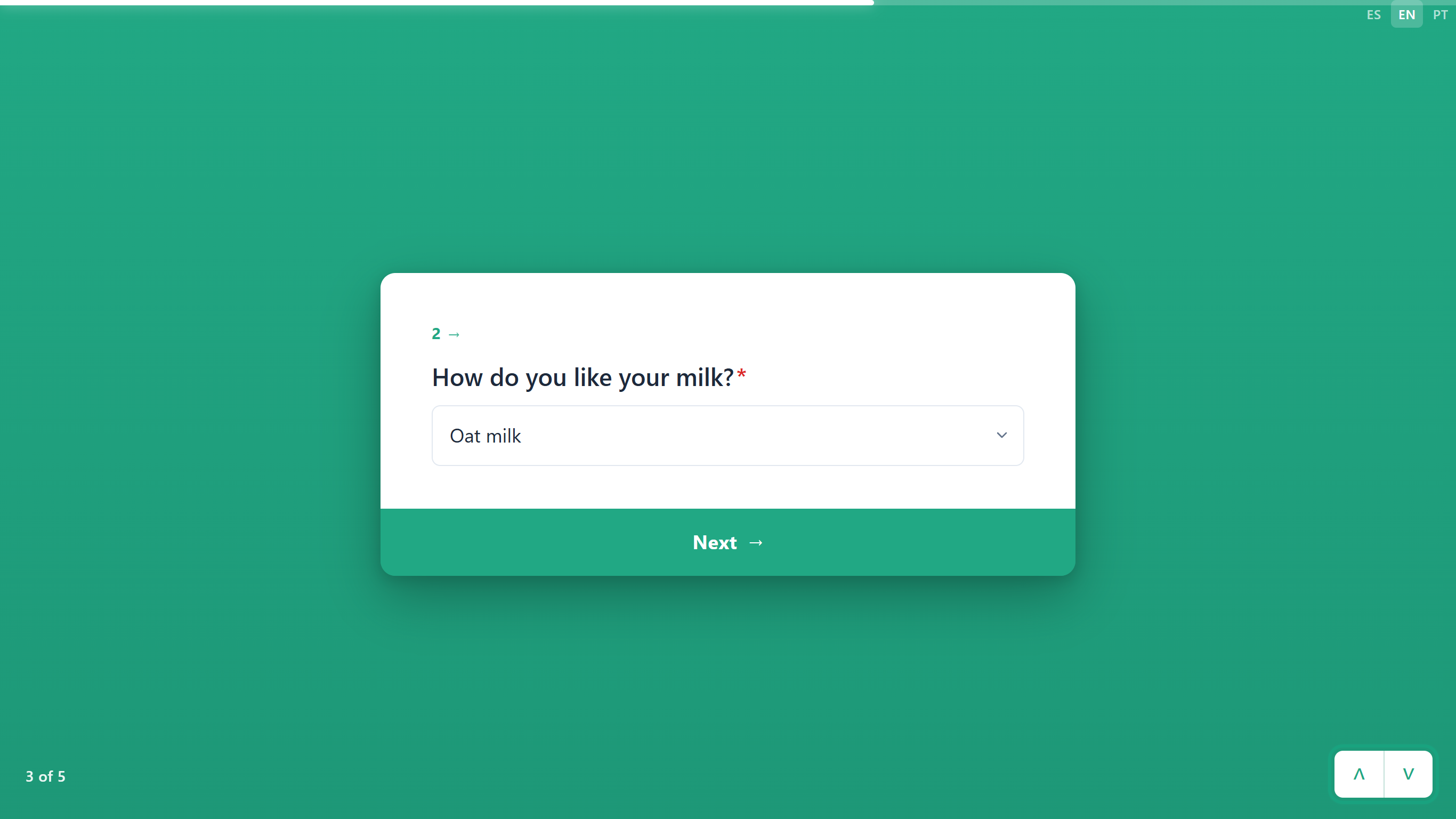 The arrows are another way to move between cards.
The marker in the bottom-left corner counts every card, the welcome card included (4 of 5), while the number on the card counts only questions (3 →).
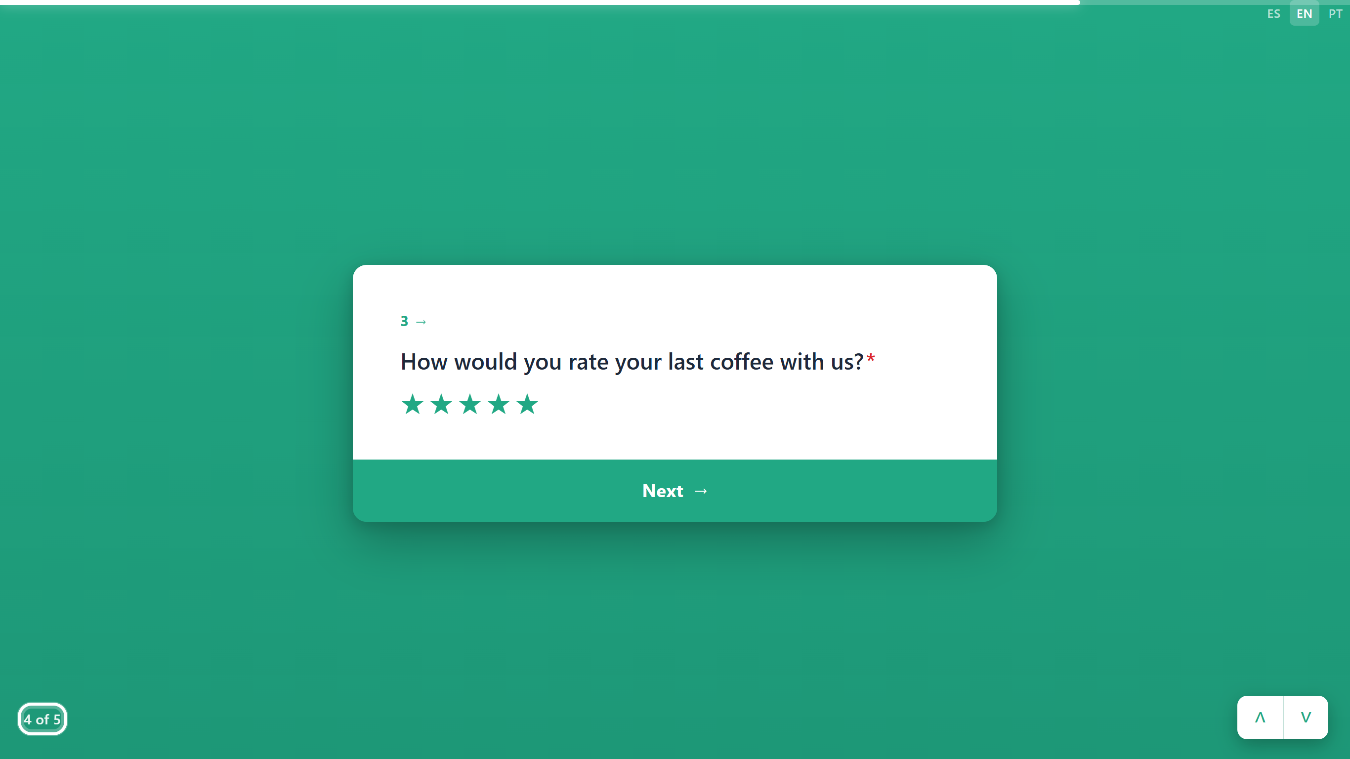 Card 4 of 5 holds question 3.
On the last card the button shows the form's submit text (Submit by default; you can change it with Submit button text in the form's Settings tab).
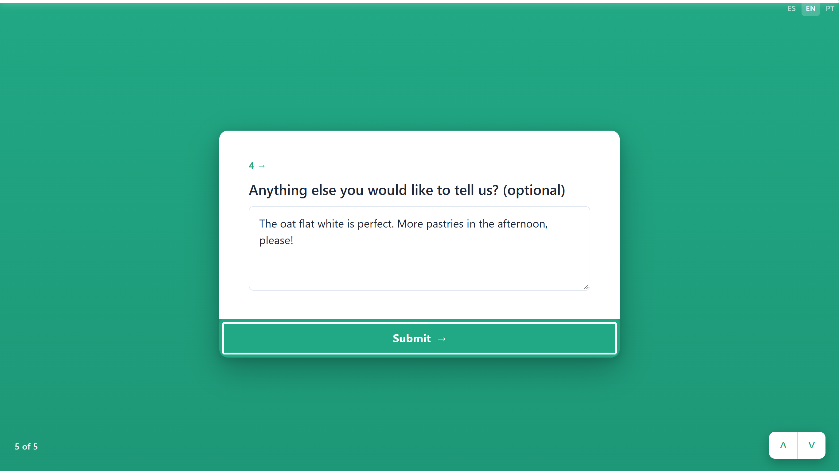 The last card sends the answers.
After submitting, the respondent sees the Card thank-you screen: your company name (and logo, if you set one), a check mark, Thank you and your Thank-you message.
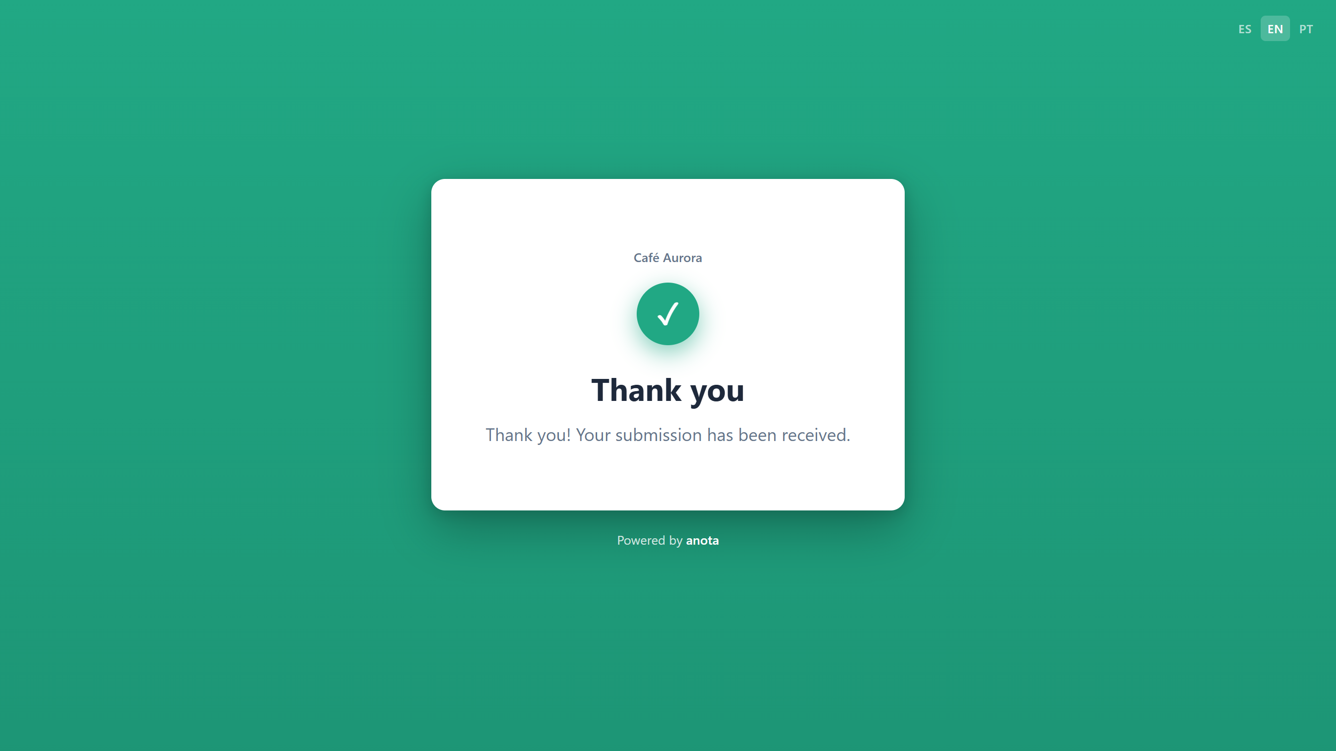 The thank-you screen of a Card form.
Result
The answers arrive in the form's submissions inbox, exactly as they do for a Classic form.
Task 4 — See a Classic form as a respondent
Step-by-step
A Classic form opens as one page: your company name (and logo), the form title, then the fields in order. The respondent scrolls down, fills them in and clicks the submit button at the end. Here is the one-page Barista Workshop Registration.
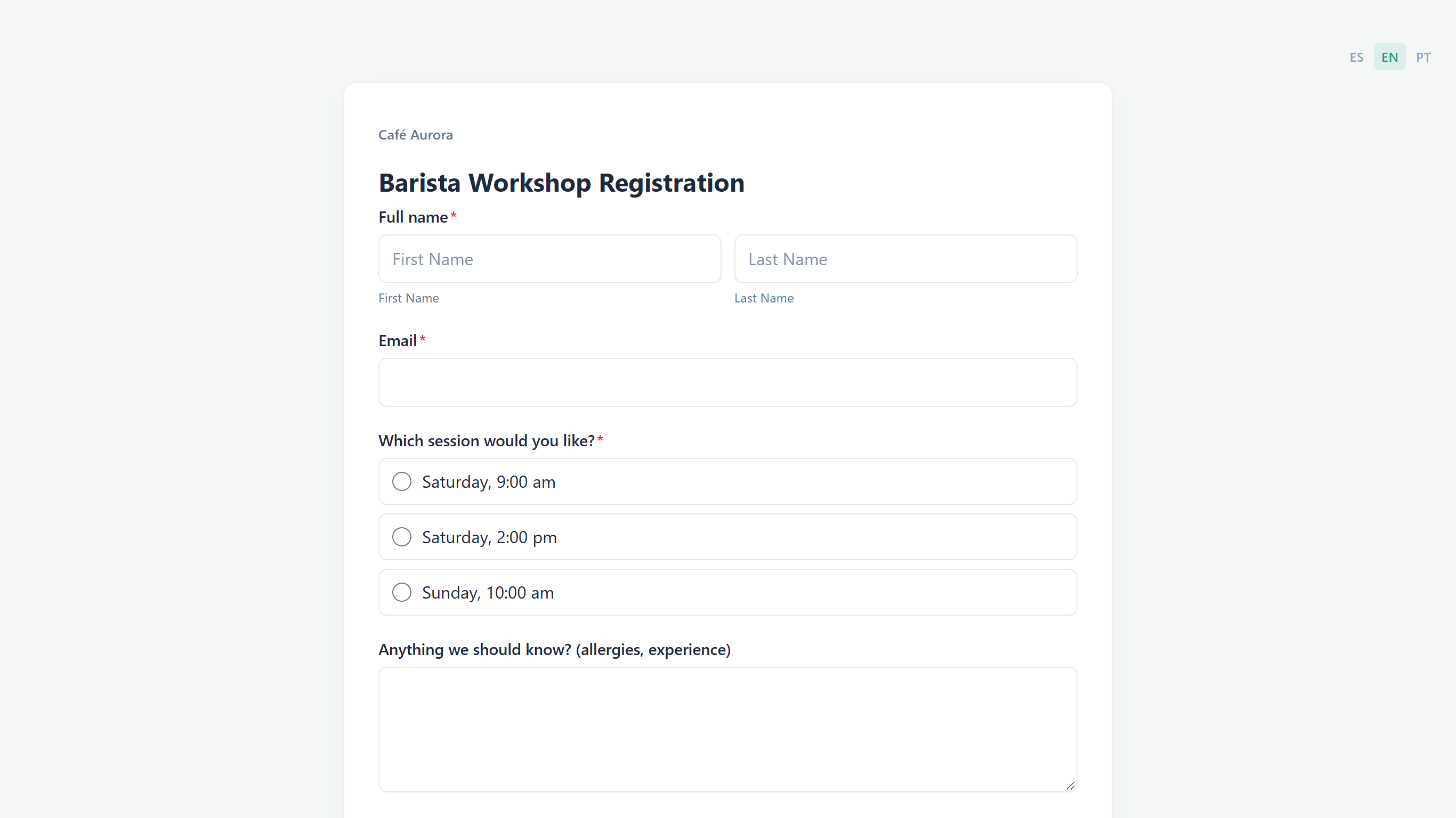 A Classic form: company name and title above the fields, which can sit side by side.
When a Classic form has more than one page, a progress bar appears under the title, each page shows its own page title, and the respondent moves with Next (and Back from the second page on). This is page 1 of Café Aurora's two-page Catering Order Request, with Email and Phone number side by side.
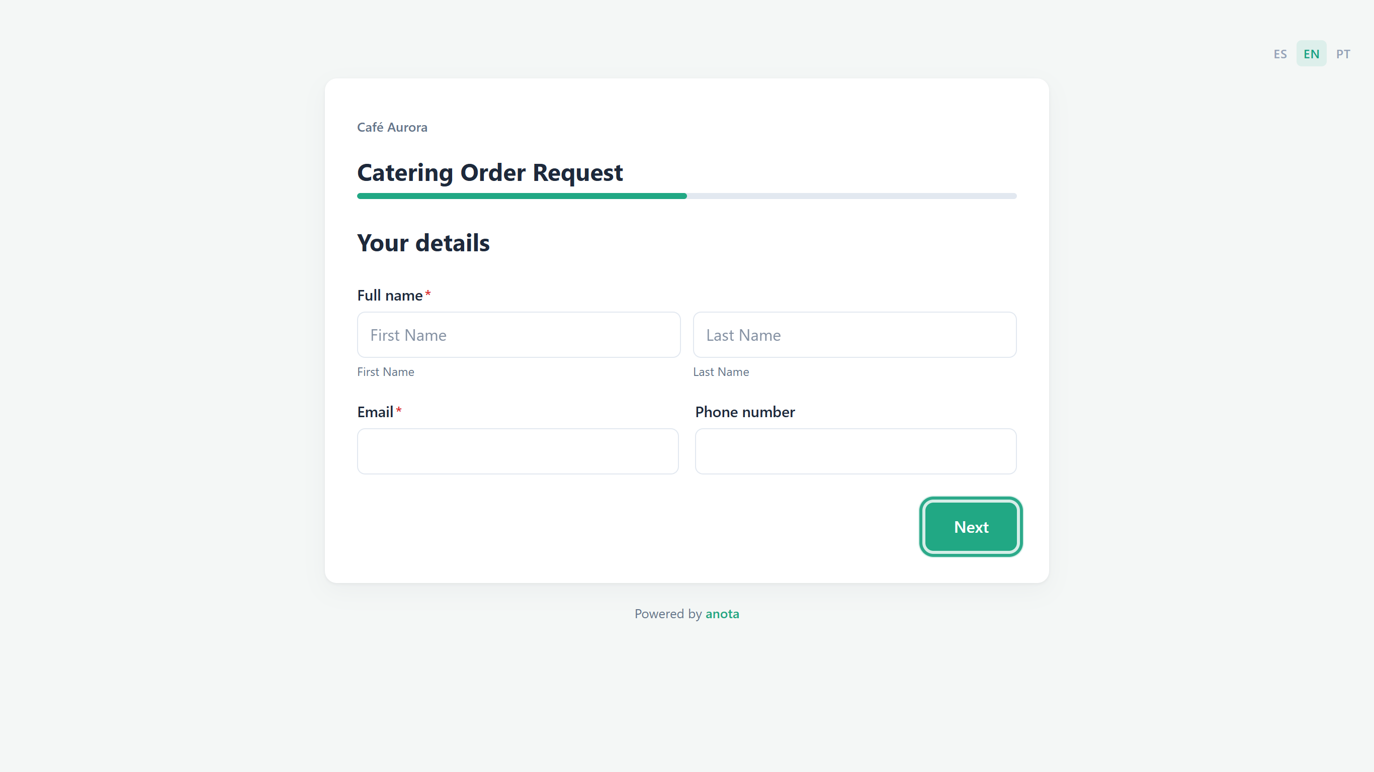 A two-page Classic form: progress bar, page title and Next.
Result
You've seen both layouts from the respondent's side. The thank-you page of a Classic form shows your company name (and logo), Thank you and your thank-you message, followed by the "Powered by anota" footer; see Getting started.
Can I change a form's layout later?
No. The layout is set once, when the form is created, and there is no setting to switch an existing form from Classic to Card or back. To offer the same questions in the other layout, create a new form with the other button and add the questions again. Clone (in the form's ⋯ menu on My forms) doesn't help here: the copy keeps the original's layout.
What the respondent sees
In both layouts:
- A language switcher (ES / EN / PT) at the top right when the form is opened directly. It is hidden when the form is embedded in another site. It changes the language of the form's interface (buttons and system messages); your questions show as you wrote them unless you added translations. See Multilingual forms.
- The submit button's text comes from Submit button text in the form's Settings tab (default Submit).
- A thank-you screen titled Thank you with the Thank-you message from the form settings (default "Thank you! Your submission has been received.").
- A "Powered by anota" footer, unless your plan removes the branding.
- If the form is closed, a closed message instead of the questions.
Classic only:
- Your company logo and name (unless Show Company name and logo is off in the form theme), then the form title.
- Page titles (when you set them), a progress bar when there is more than one page, and Back / Next between pages.
Card only:
- A full-screen card on the theme background, without the form title. The Company name and logo are not shown while the respondent answers; they appear on the thank-you screen.
- A progress bar across the top of the screen when the form has more than one card.
- A question number on each question card, the "N of M" card marker at the bottom left and the up/down arrows at the bottom right.
- A full-width button at the bottom of each card: Start on a welcome card, Continue on a statement card, Next on a question card, and the submit text on the last card.
- The "Powered by anota" footer sits below the card, at the bottom of the page.
Comparison: Classic vs. Card
| Aspect | Classic | Card |
|---|---|---|
| Created with | Create form (and every template) | Create card form |
| Presentation | Scrolling page with the fields in sequence | One card at a time, full screen |
| Questions per screen | As many as you put on the page | One: each field you add gets its own card |
| Several pages | Optional, with + Add page | Each card is a page |
| Navigation | Next / Back between pages | Button on the card, or the up/down arrows (no swipe) |
| Progress indicator | Progress bar (more than one page) | Progress bar, question number and "N of M" marker |
| Fields side by side | Yes, with Width or by dropping a field on another field's edge | No |
| Welcome and statement screens | No | Yes, cards with only display elements |
| Logo and form title while answering | Yes | No (Company name and logo on the thank-you screen) |
| Editing fields | Field actions next to the selected field (move, duplicate, delete), drag and drop | Click a field to open Properties; Delete card removes a card |
| Change layout later | No | No |
Roles & permissions
| Role | Create a Classic or Card form | Edit and publish |
|---|---|---|
| Owner | Yes | Yes |
| Admin | Yes | Yes |
| Editor | Yes | Yes |
| Viewer | No | No (view only) |
Troubleshooting
| Symptom | Likely cause | Resolution |
|---|---|---|
| I can't find a setting to switch a form from Classic to Card | The layout is fixed when the form is created | Create a new form with Create card form (or Create form for Classic) and add the questions again. A clone keeps the original layout |
| Every field I add lands on a new card | That's how Card forms work: one question per card | Use a Classic form if you want several questions on one screen |
| I don't see the move, duplicate and delete buttons next to a field | Card forms don't have field actions | Click the field to open Properties (it has Delete), or use Delete card under the card |
| My first card doesn't show Start | The first card holds a question, so it's a question card, not a welcome card | Make the first card hold only display elements, such as a Heading. On a new form, add the heading first |
| Swiping doesn't move to the next card | Card forms have no swipe gesture | Use the button at the bottom of the card or the arrows in the bottom-right corner |
| My logo doesn't show while respondents answer the Card form | The Card layout shows the Company name and logo only on the thank-you screen | Use a Classic form if you need your branding visible throughout |
| The language switcher doesn't show on my website | The form is embedded, and the switcher is hidden inside embeds | Set the language through the embed code. See Publish and share |
Related features
- The form editor
- Field types
- Theme and appearance: colors, fonts, logo and Show Company name and logo
- Conditional logic
- Multilingual forms
- Publish and share
- Templates
Was this page helpful?