Field types
Field types
Applies to: anota, all plans Roles required: Editor or above (to add and edit fields) Regulatory references: none
Overview
This page describes every field you can put on an anota form, in the same groups as the Form elements panel of the editor. For each one you'll see what the person filling in your form sees, and the settings that make that field different from the others.
The examples come from a Customer Feedback Survey for Café Aurora, a coffee shop that asks its guests how their visit went. It uses every field type, so you can see them all in one place.
Key concepts
- Form elements panel: the list of field types that opens when you click + Add element in the editor. It has a Search fields… box and eight groups: Basic, Contact, Choice, Date & time, Survey, Uploads & more, Payment and Security.
- Properties panel: the settings of the selected field, on the right of the editor. Fields have up to three sections: Content (what it says), Validation (what counts as a valid answer) and Appearance (how it's laid out). Some fields add their own settings to these sections; this page shows them.
- Common settings: most fields have a Label (the question), a Help text (a hint under the field), Required, Hidden (shown by a rule) (see Conditional logic) and Width (Full, Half, Third or Quarter). These work the same for every field; see The form editor.
- Display-only elements: Heading, Paragraph, Image, Divider and Section show content but don't collect an answer, so they have no Required or Hidden (shown by a rule) option.
Task 1 — Add a field and set it up
Prerequisites
- A form open in the editor (see The form editor) and a role of Editor or above.
Step-by-step
On the Build tab, click + Add element. The Form elements panel opens with every field type, grouped by category. Here the Survey group holds Rating, Scale and Matrix.
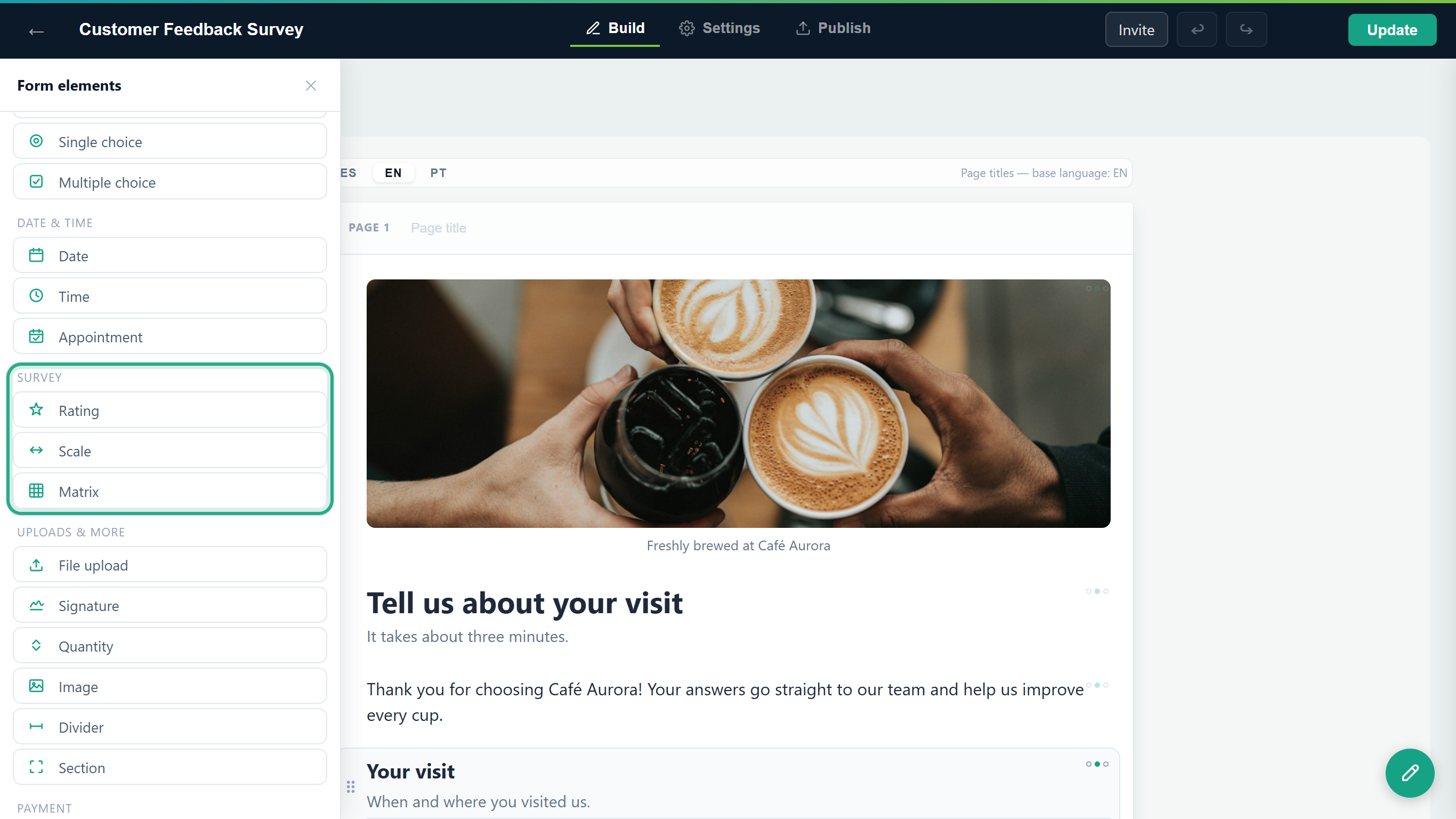 The field types are grouped the same way as the sections of this page.
If you know the name, type part of it in Search fields…: the list keeps only the matching fields. Click a field to add it below the selected field (or at the end of the page), or drag it to the exact spot on the form.
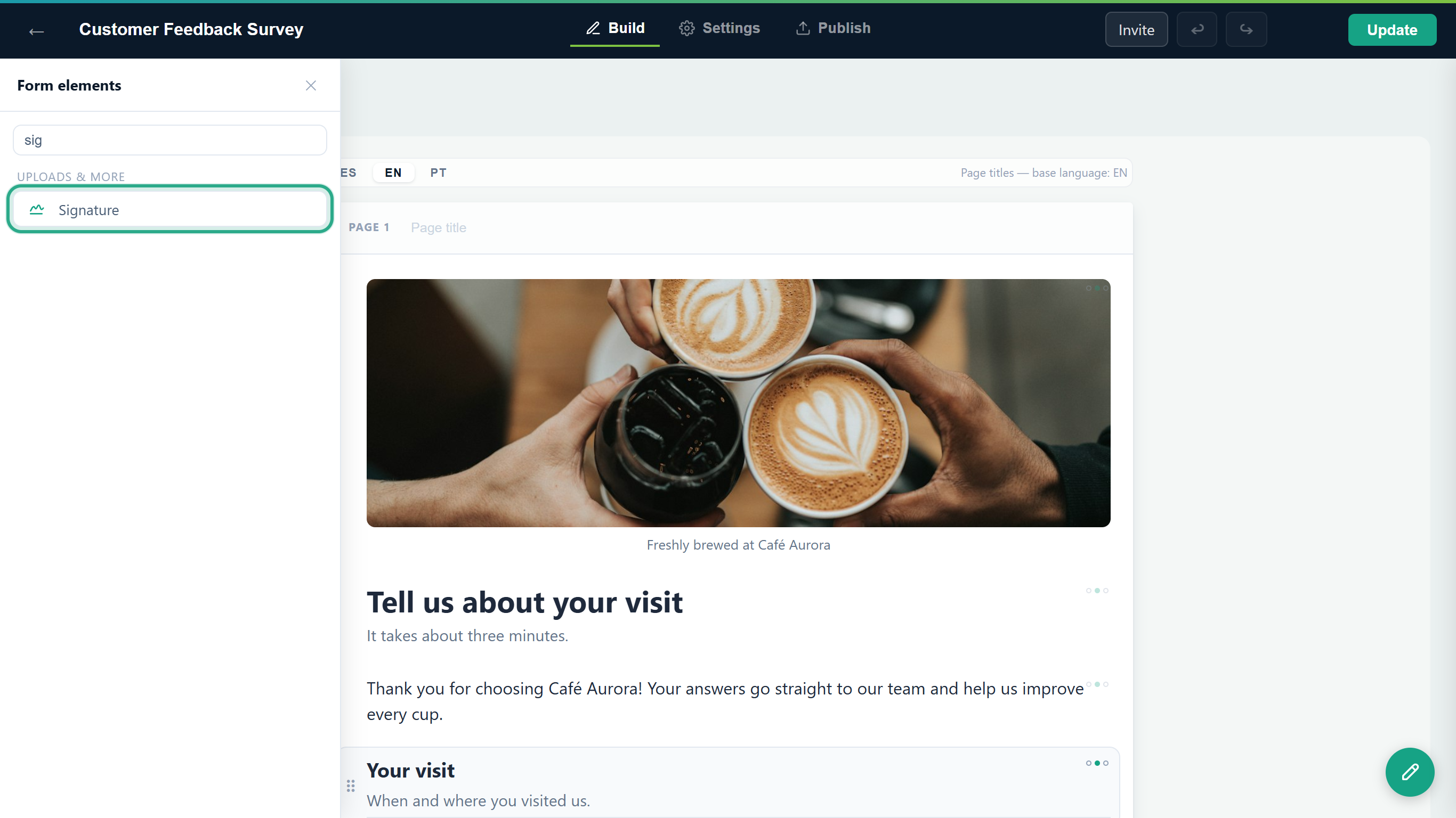 Typing "sig" leaves only Signature.
Select the field on the form and open Properties (the gear next to it). Type your question in Label, then adjust the settings for that field type. Here the Rating field "How was your coffee?" is Required and has 5 Stars.
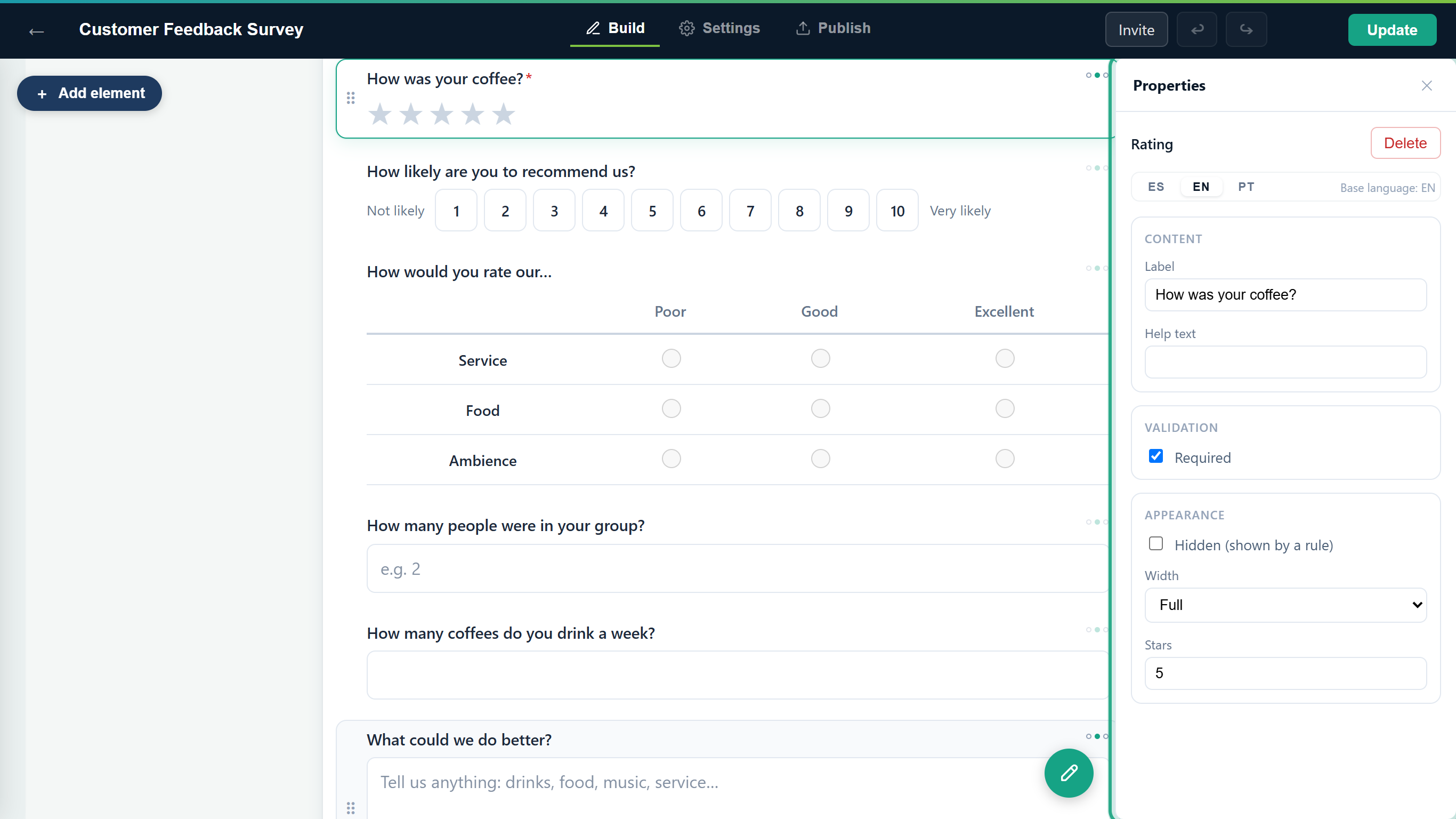 The Properties panel shows the common settings plus the ones for this type (here, Stars).
Result
The field is on the form with your settings. As with any change, it reaches the public form when you click Publish (or Update if the form is already live).
Basic
Heading and Paragraph
A Heading is a large title that opens a part of the form; its Help text shows as a subtitle under it. A Paragraph is a block of text for welcome words or instructions, written in its Text box. Neither collects an answer.
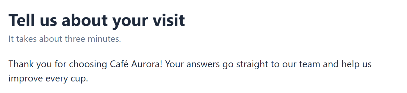 A Heading with a subtitle, and a Paragraph.
The heading's Size is under Appearance: Large, Medium (the default) or Small.
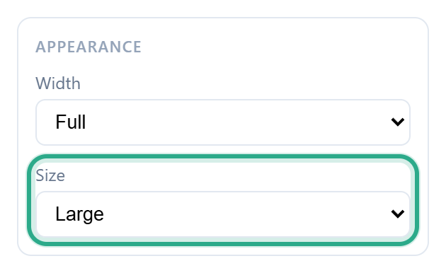 Heading Size.
Short text
A one-line answer, for a name, a code or a short reply. You can add a Placeholder, grey example text shown in the empty box.
 A Short text field with the placeholder "e.g. Oat flat white".
Under Validation, Length & pattern opens three optional rules: Min length, Max length and Pattern (regex). Long text has the same rules.
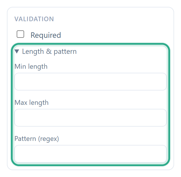 Click Length & pattern to show the text rules.
Long text
A larger box for comments and descriptions. It is 4 rows tall by default; change it with Rows under Appearance (2 to 20).
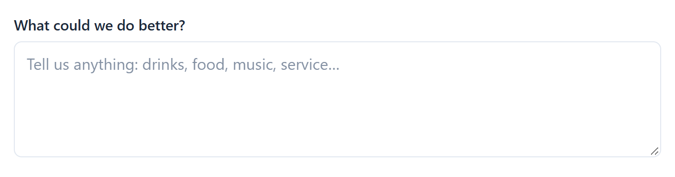 A Long text field.
Email and Phone number
Email only accepts a valid email address; otherwise the respondent sees "Label must be a valid email address." Phone number needs at least 7 digits; otherwise the respondent sees "Label must be a valid phone number." Both can have a Placeholder. Here both are set to Half width, so they share a row.
 Two Half fields sit side by side.
Number
Accepts numbers only. Use it for things like a group size or an age.
 A Number field.
Under Validation, Minimum and Maximum limit the accepted range. Here the group can be 1 to 20 people.
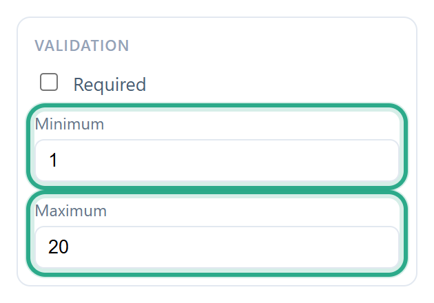 The allowed range of a Number field.
Contact
Full name
One question with separate First Name and Last Name boxes, so you don't need two text fields. When it's required, both parts must be filled in.
 A Full name field.
Address
One question with Street Address, City, State / Province and ZIP / Postal Code boxes. Use it when you need a mailing or delivery address.
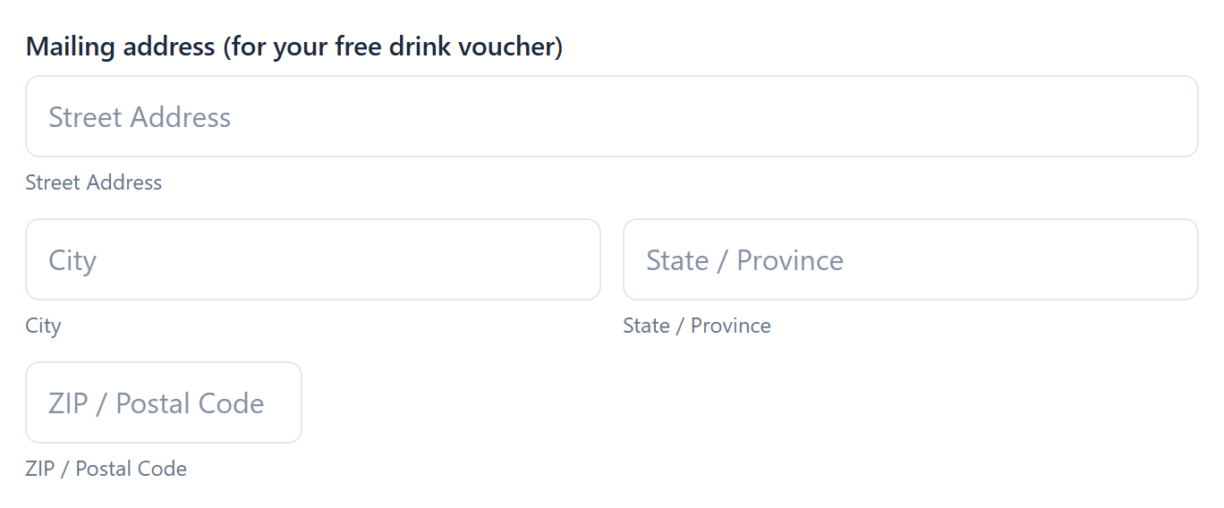 An Address field.
Choice
Dropdown, Single choice and Multiple choice all start with three sample options ("Option 1", "Option 2" and "Option 3"). Replace them with your own under Options in Properties.
Dropdown
A drop-down menu that shows Select... until the respondent picks one option. It saves space when there are many options.
 A Dropdown. The options (Downtown, Riverside, Airport kiosk) appear when it's opened.
Single choice
A visible list of options; the respondent picks one. With Allow "Other" ticked, the list ends with Other: and a Please specify box for an answer you didn't list.
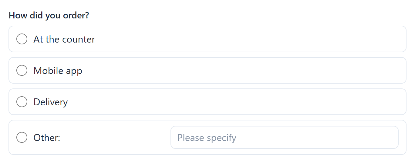 A Single choice list with Allow "Other" on.
Multiple choice
A list of checkboxes; the respondent can tick one or more. It also offers Allow "Other".
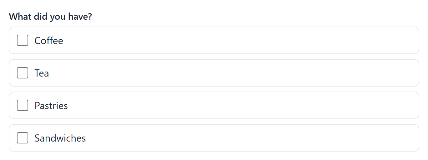 A Multiple choice list.
In Properties, edit each option's text, remove one with ✕ and add more with + Add option. Allow "Other" is below the options (Single choice and Multiple choice only). On a published form, removing an option asks for confirmation first; see The form editor.
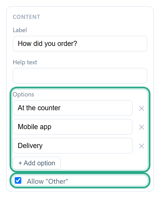 Options and Allow "Other".
Date & time
Date and Time
Date opens a date picker, for a visit date, a due date or a birth date. Time opens a time picker, for a time of day on its own.
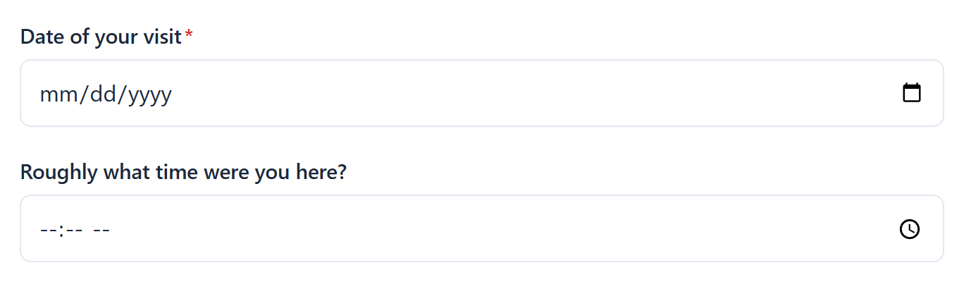 A Date field and a Time field.
Appointment
A booking in one question: a Date and a Time chosen from Select a time…. The times run every 30 minutes from 09:00 to 16:30. When it's required, both the date and the time must be chosen.
 An Appointment field.
Survey
Rating
A row of stars; the respondent clicks one to rate.
 A Rating field rated 4 out of 5: the chosen star and every star before it fill in.
Stars, under Appearance, sets how many stars to show: 3 to 10 (5 by default).
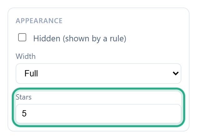 The number of stars.
Scale
A row of numbered buttons from 1 to 10, with a label at each end. It suits "how likely…" and agreement questions, such as a recommendation score.
 A Scale field.
Change the end labels with Left label and Right label (they start as "Not likely" and "Very likely"), and the top of the scale with Scale max under Appearance (5 to 11).
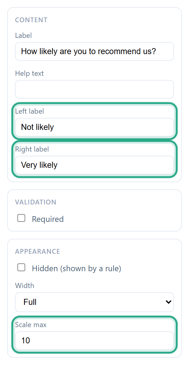 The labels and length of a Scale.
Matrix
A grid that asks several things on the same scale at once: each row is a question, each column an answer, and the respondent picks one answer per row.
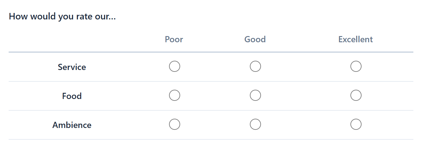 A Matrix rating service, food and ambience.
Type the rows in Rows (one per line) and the answers in Columns (one per line). A new matrix starts with 2 rows and 3 columns. On a published form, changing them asks for confirmation first.
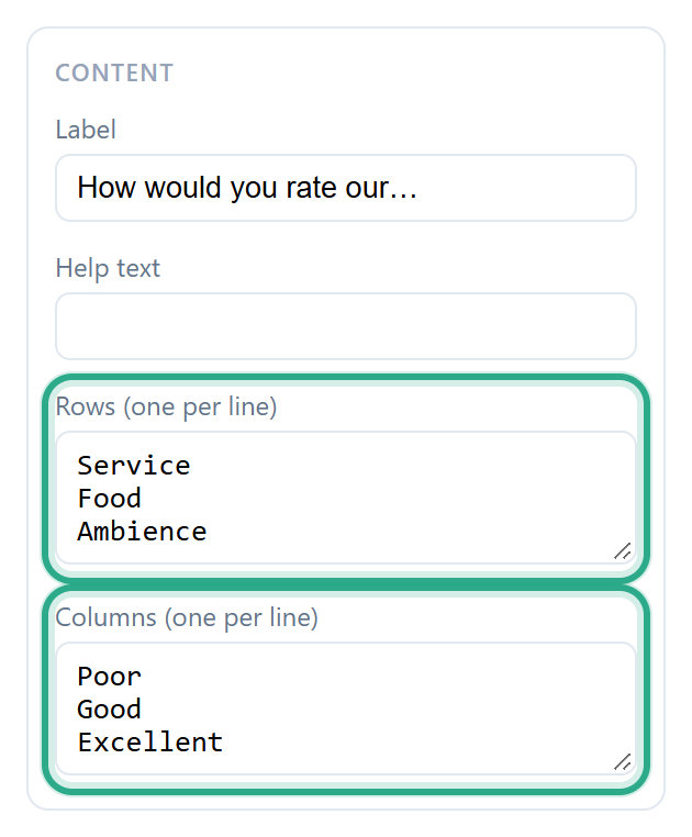 Rows and columns, one per line.
Uploads & more
File upload
A Choose Files button that lets the respondent attach files, with the size limit shown underneath. See Signatures and file uploads.
 A File upload field.
Under Validation, Max files (1 to 10, default 1) and Max size (MB) per file (1 to 50, default 10) set the limits. With more than 1 file allowed, the respondent can pick several files at once.
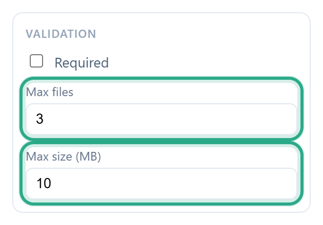 Upload limits.
Signature
A Sign here box where the respondent signs with the mouse, a finger or a pen. Clear wipes it to start again. See Signatures and file uploads.
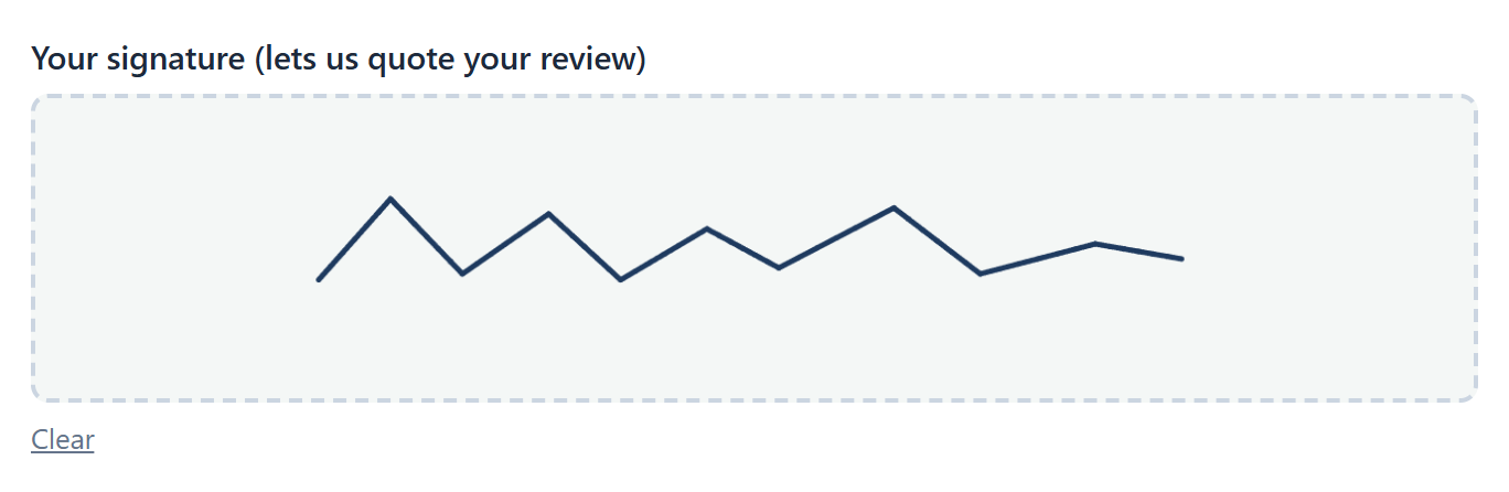 A Signature field after signing.
Quantity
A number box meant for a count, such as a number of units. Like Number, it has Minimum and Maximum under Validation (here 0 to 50).
 A Quantity field.
Image
Shows a picture on the form, for a banner or an example. Its Label becomes the caption under the picture. It doesn't collect an answer.
 An Image with a caption.
In Properties, paste the picture's web address in Image URL (it must be an image already online), and describe it in Alt text for people who use screen readers.
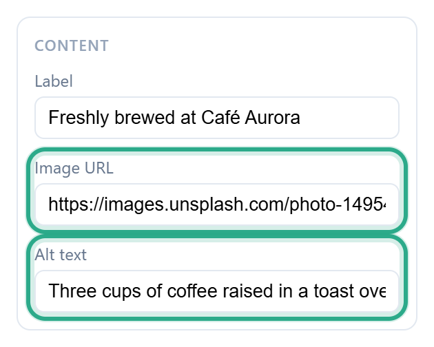 The image address and its description.
Divider and Section
A Divider is a thin line that separates parts of the form. A Section is a titled block: its Label is the title and its Help text the description under it. Neither collects an answer.
 A Divider followed by a Section.
Payment
Products
A list of products, each with a checkbox, a price and, when allowed, a Qty box. The respondent ticks what they want to build an order. By default the order is only recorded; if Stripe payments are enabled for your workspace and turned on for the form, the respondent pays when they submit.
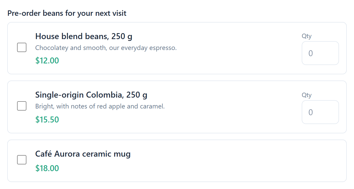 A Products field with three items.
The product list (Currency, and for each product its name, price, Allow quantity and maximum quantity) is edited in Properties only when Stripe payments are enabled for your workspace. Setting up products and payments is explained in Products, orders and Stripe payments.
Security
Verification (CAPTCHA)
Protects the form against automated spam. The respondent doesn't solve a puzzle; the form shows "This form is protected against automated spam." and anota checks the submission in the background. If the check fails, the respondent sees "Please verify you're not a robot." This field is always enforced, so it has no Required option.
 The CAPTCHA note on the public form.
Field settings at a glance
| Field | Settings of its own (besides Label, Help text, Required, Hidden and Width) |
|---|---|
| Heading | Size (Large, Medium, Small). No Required or Hidden. |
| Paragraph | Text (instead of Label and Help text). No Required. |
| Short text | Placeholder; Length & pattern (Min length, Max length, Pattern (regex)) |
| Long text | Placeholder; Length & pattern; Rows (2–20, default 4) |
| Email, Phone number | Placeholder |
| Number, Quantity | Minimum, Maximum (Number also has Placeholder) |
| Full name, Address | — |
| Dropdown | Options |
| Single choice, Multiple choice | Options, Allow "Other" |
| Date, Time, Appointment | — (Appointment times: every 30 minutes, 09:00–16:30) |
| Rating | Stars (3–10, default 5) |
| Scale | Left label, Right label, Scale max (5–11, default 10) |
| Matrix | Rows (one per line), Columns (one per line) |
| File upload | Max files (1–10, default 1), Max size (MB) (1–50, default 10) |
| Signature | — |
| Image | Image URL, Alt text; Label is the caption. No Required. |
| Divider | — (only Width) |
| Section | Label is the title, Help text the description. No Required. |
| Products | Currency and the product list, when Stripe payments are enabled |
| Verification (CAPTCHA) | — (always enforced) |
Roles & permissions
| Role | Add, edit and delete fields |
|---|---|
| Owner / Admin | Yes |
| Editor | Yes |
| Viewer | No |
Troubleshooting
| Symptom | Likely cause | Resolution |
|---|---|---|
| I can't find a field type | It's in a different group | Type part of its name in Search fields…. |
| I added a field but it isn't on the public form | The change is still in the draft | Click Publish (or Update) after you set up the field. |
| A field doesn't force an answer | Required is off | Tick Required under Validation in the field's properties. |
| A Heading, Image or Section has no Required option | Display-only elements don't collect answers | Nothing to fix; use a question field if you need an answer. |
| The Products field has no product editor in Properties | Stripe payments aren't enabled for your workspace | See Products, orders and Stripe payments. |
| The Image field shows "No image" | Image URL is empty | Paste the web address of an image that is already online. |
| Claude can't edit or delete a field on a published form | Through the MCP connector, the existing fields of a published form are locked. The editor itself doesn't have this lock. | Edit the field in the editor, or ask Claude to add a new field or clone the form. See Connect Claude and ChatGPT (MCP). |
Related features
Was this page helpful?