Theme and appearance
Theme and appearance
Applies to: anota, all plans Roles required: Editor or above to change a form's theme and texts; Owner or Admin to set the company logo Regulatory references: none
Overview
Every form has its own look: a palette, a primary color, page and card colors, a font, a button style and a logo. This guide shows you how to give a form your brand's look and check the result on the public form. It's for anyone who builds forms; setting the company logo needs an Owner or Admin.
The example gives Café Aurora's Barista Workshop Registration form a warm coffee-shop look: a coffee-brown accent, a cream background, a serif font, rounded pill buttons and the café's logo.
Key concepts
- Designer panel: the panel where you set a form's theme. You open it with the floating pencil button, ✏ Design, on the Build tab. It's the only place to change the theme: the Settings tab has no theme section.
- Palette: a ready-made combination of primary color, page background and card color. It's a quick starting point; you can adjust each color afterwards.
- Draft and published form: theme changes save automatically to the form's draft, and the builder canvas shows them right away. Visitors keep seeing the previous look until you click Update (or Publish the first time).
- Company logo vs. form logo: the company logo and Company name are set once for the whole workspace, on Account settings > Company. Every form uses them unless you enter a Logo URL for that one form.
Task 1 — See how your form looks today
Step-by-step
Open your form's public link (you'll find it on the Publish tab, under Share). Take a look before you change anything, so you can compare afterwards. A new form uses anota's default theme: green accent, light grey page, white card, and the company name at the top.
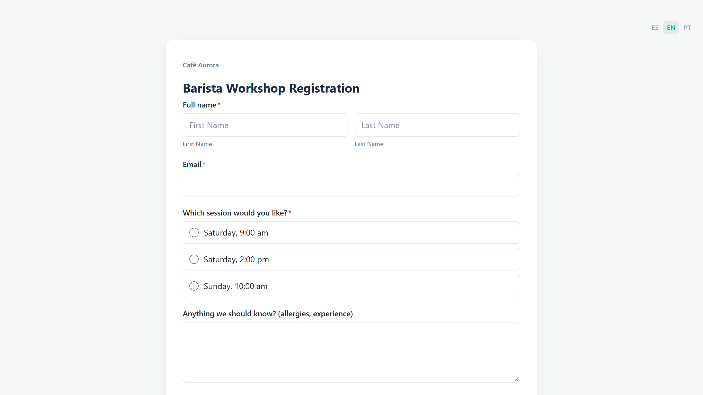 Before: the form with the default theme.
Task 2 — Open the Designer panel
Prerequisites
- A role of Editor or above in the workspace.
Step-by-step
Open the form in the form editor. On the Build tab, click the round pencil button at the bottom right of the canvas. When you point at it, it shows the word Design.
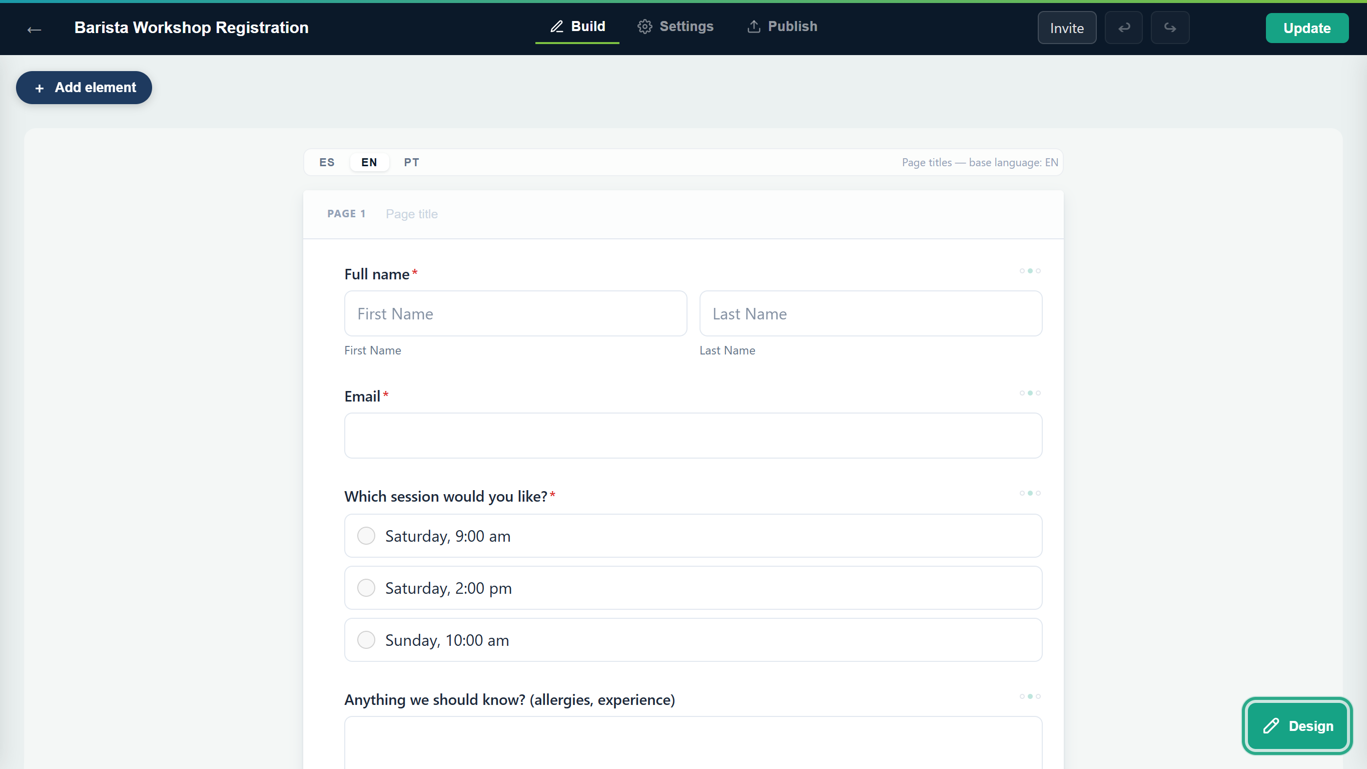 The ✏ Design button opens the theme settings.
The Designer panel opens on the right, with the Form theme settings: Palettes, Primary color, Page background, Card color, Font, Button style, Logo URL and Show Company name and logo. The canvas on the left shows your changes as you make them.
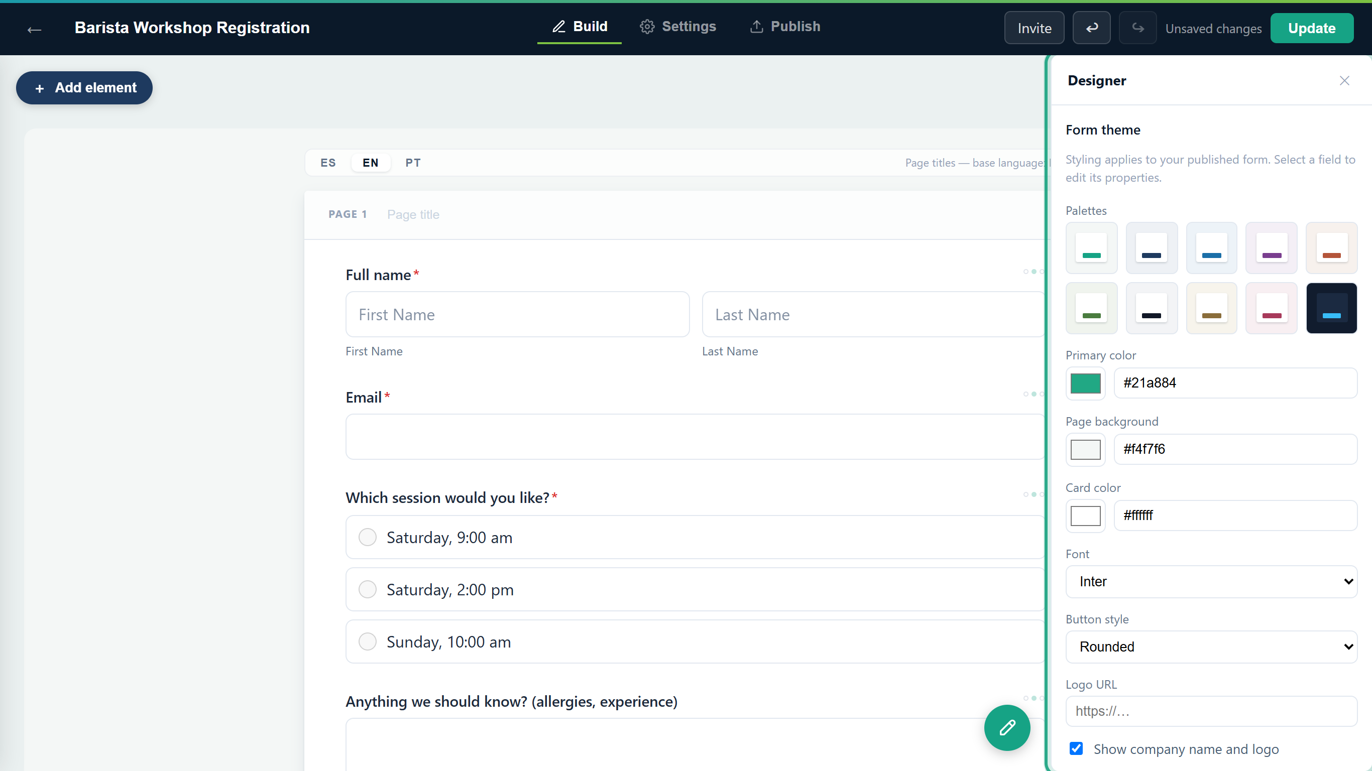 The Designer panel. Click ✕ to close it.
Result
The Designer panel is open next to your form, ready for the next tasks.
Task 3 — Start from a palette
Step-by-step
Under Palettes, click a tile. Each tile is a small preview: the page background around a card, with the primary color as a button. The tile you apply is outlined, and the three colors below update. For Café Aurora, the warm brown-and-cream tile in the second row is a good start.
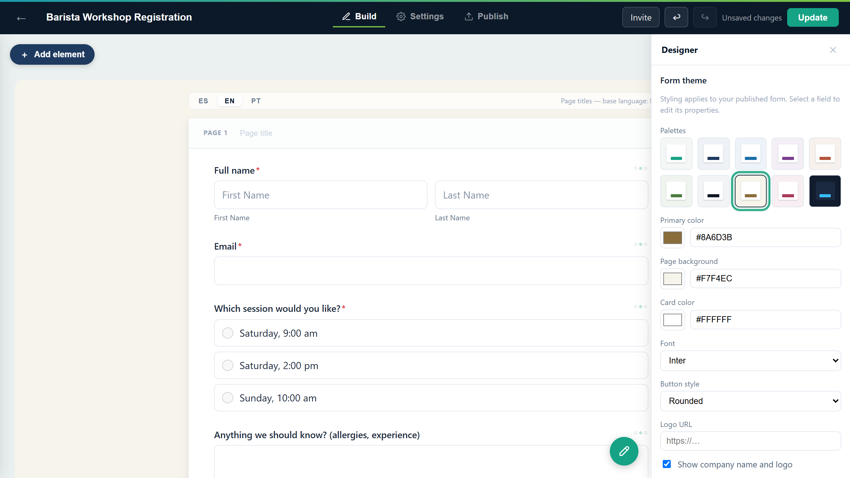 The palette fills in Primary color, Page background and Card color in one click.
Result
The form has a coordinated set of colors. You can stop here, or fine-tune them in Task 4.
Task 4 — Set your exact brand colors
Step-by-step
Primary color is the accent used for buttons, links and highlights. Type your brand's color code in the box (for Café Aurora,
#6F4E37, a coffee brown) and press Tab. You can also click the color square to pick a color visually.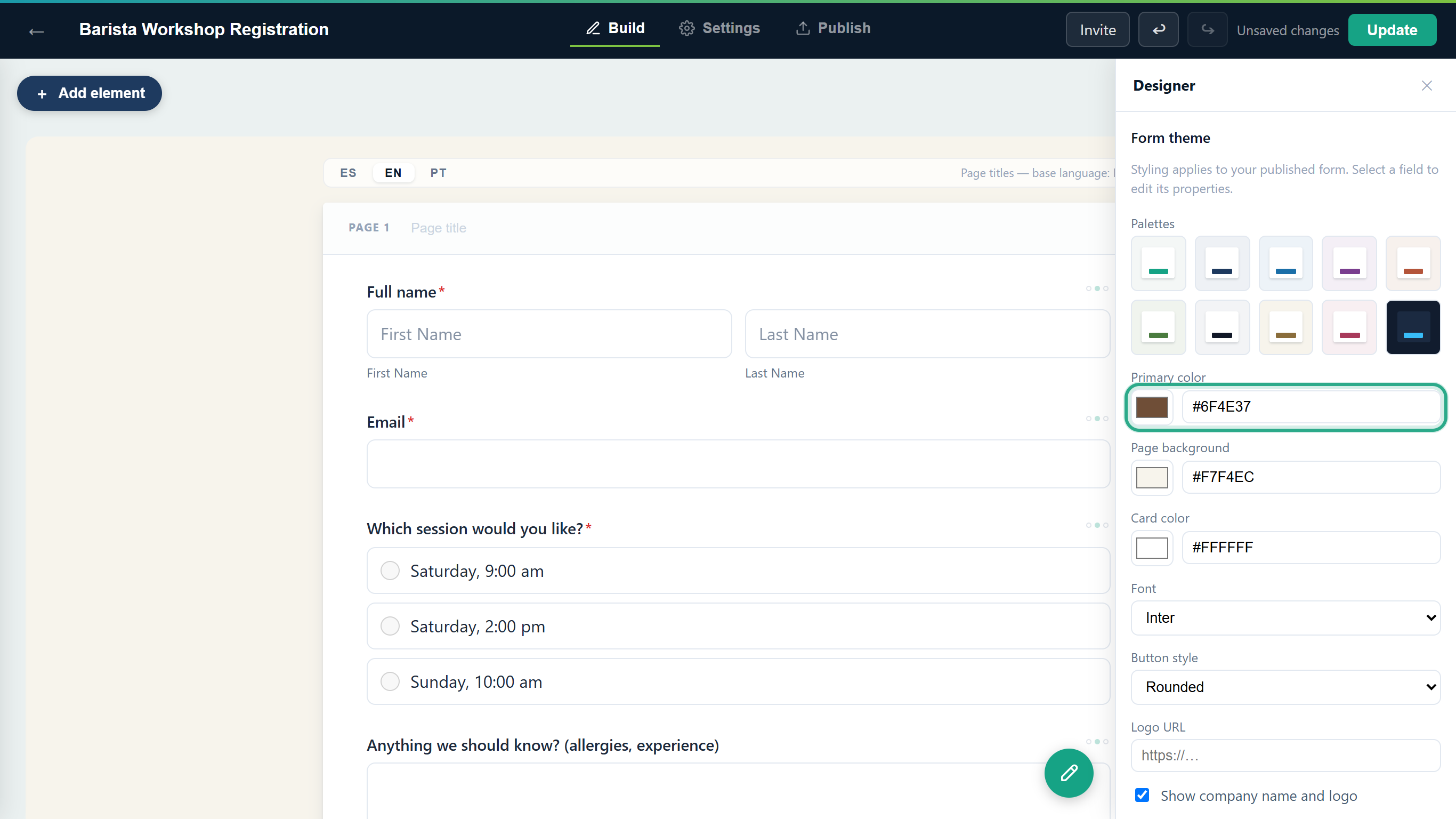 Type the exact hex code, or click the square to use the color picker.
Page background is the color around the form card. Enter
#F3E9DC, a cream, and press Tab. The canvas background changes right away.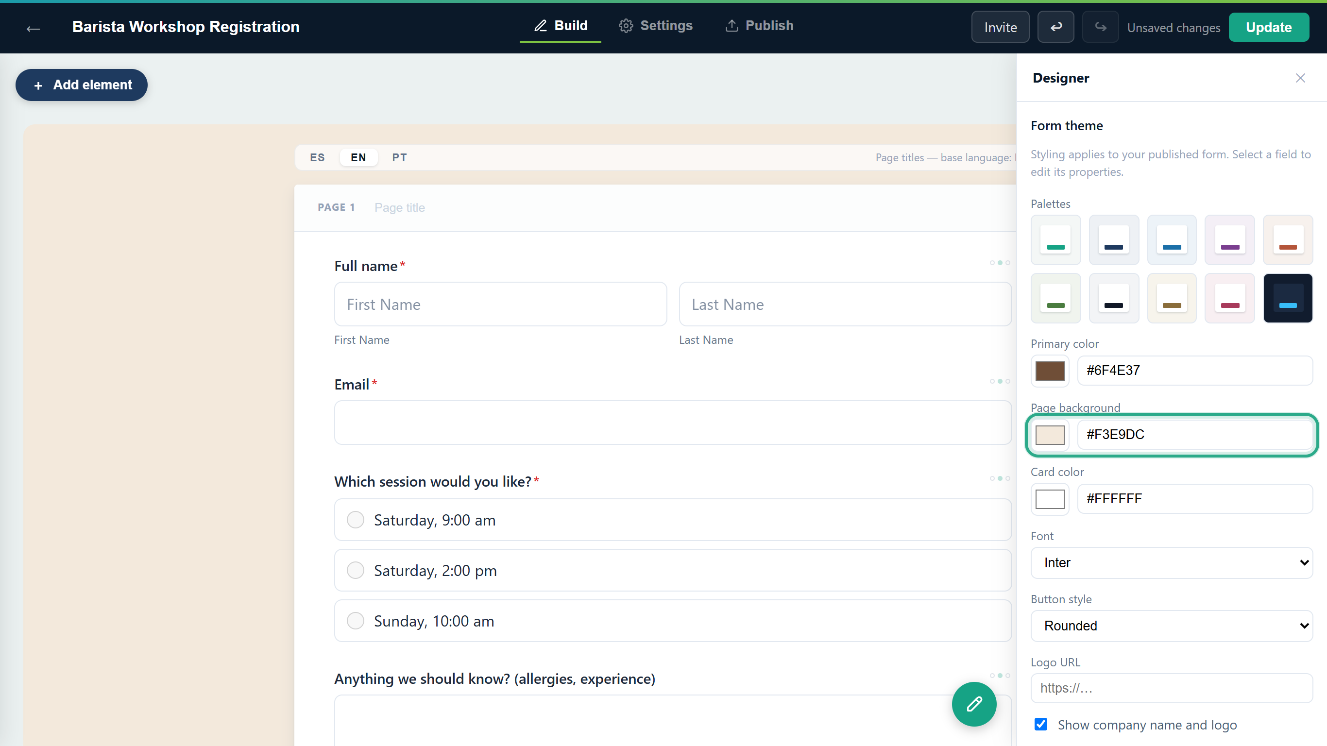 The page background fills the space around the form.
Card color is the background of the card that holds the questions. Enter
#FFFCF7, a warm white, and press Tab.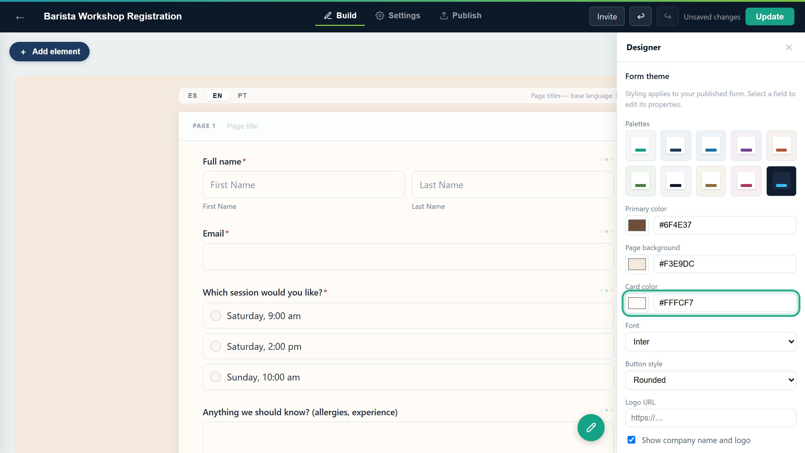 A slightly warm card goes well with a cream page.
There's no separate setting for the text color. If you pick a dark Card color, anota automatically switches the form's text and borders to light colors so the questions stay readable. The dark Midnight palette (the last tile) works the same way.
Result
The three colors match your brand. When the colors match a palette exactly, that palette's tile is outlined; once you change them, no tile is.
Task 5 — Choose a font and a button style
Step-by-step
Open Font and choose a typeface: Inter (the default), system-ui, Georgia, Roboto Slab, Poppins or Courier New. For a classic café feel, choose Georgia. The questions on the canvas switch to the new font.
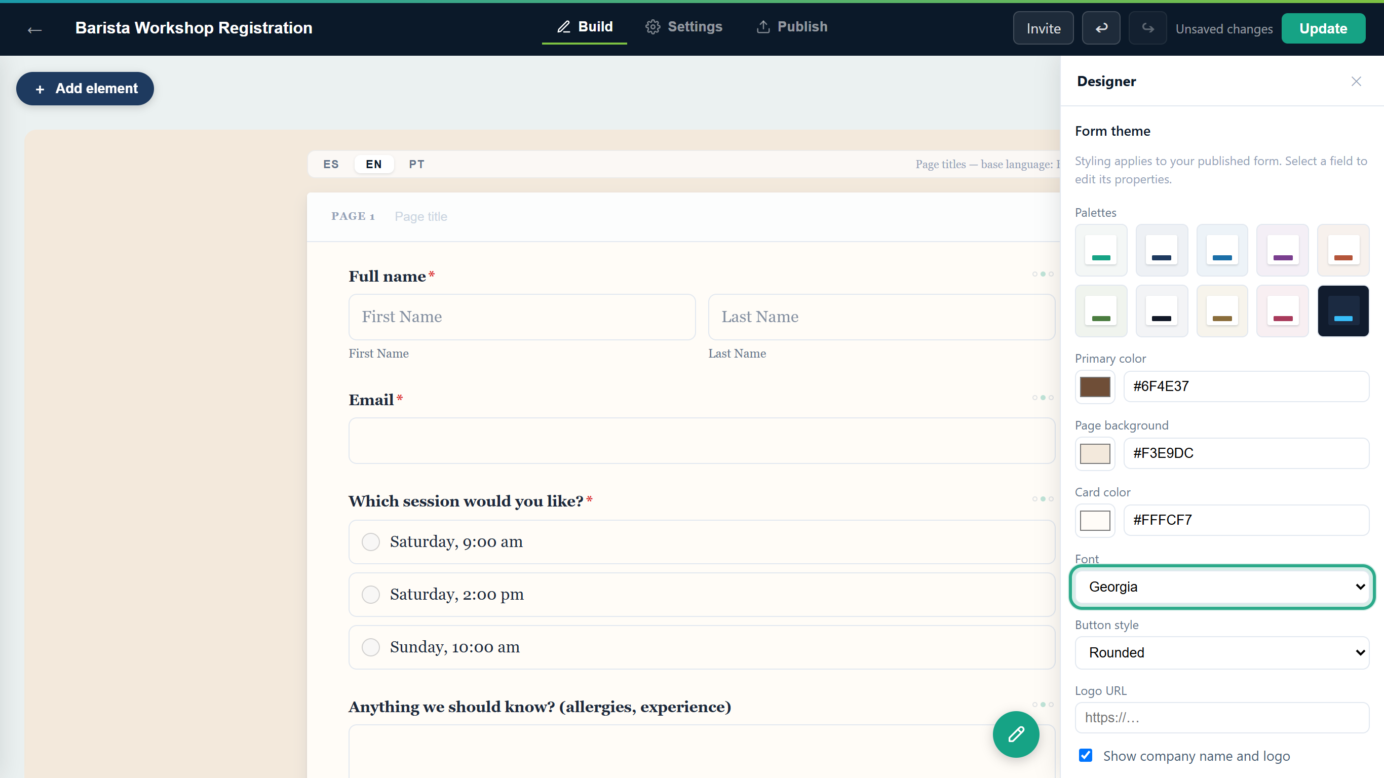 The font applies to the whole form: title, questions and answers.
Inter, Roboto Slab and Poppins are web fonts that anota loads for every visitor, so they look the same on every device. Georgia, system-ui and Courier New use the visitor's own system fonts.
Open Button style and choose the shape of the buttons: Rounded (the default), Pill (fully rounded ends) or Square. Choose Pill.
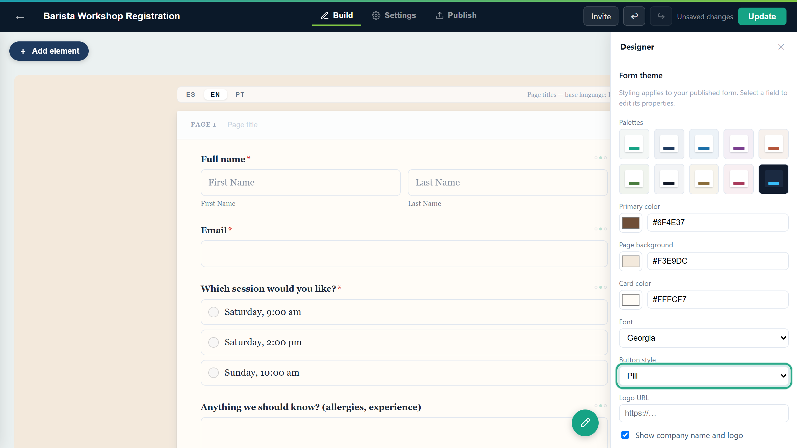 You'll see the new button shape on the public form in Task 8.
Result
Colors, font and button style are set. The builder saves them automatically.
Task 6 — Add your company logo
Prerequisites
- A role of Owner or Admin. Editors can see which logo a form uses, but only Owners and Admins can change the company logo.
- An image file in PNG, JPG or WebP format, up to 2 MB.
Step-by-step
Click your email address at the top right to open Account settings, then click Company in the menu on the left.
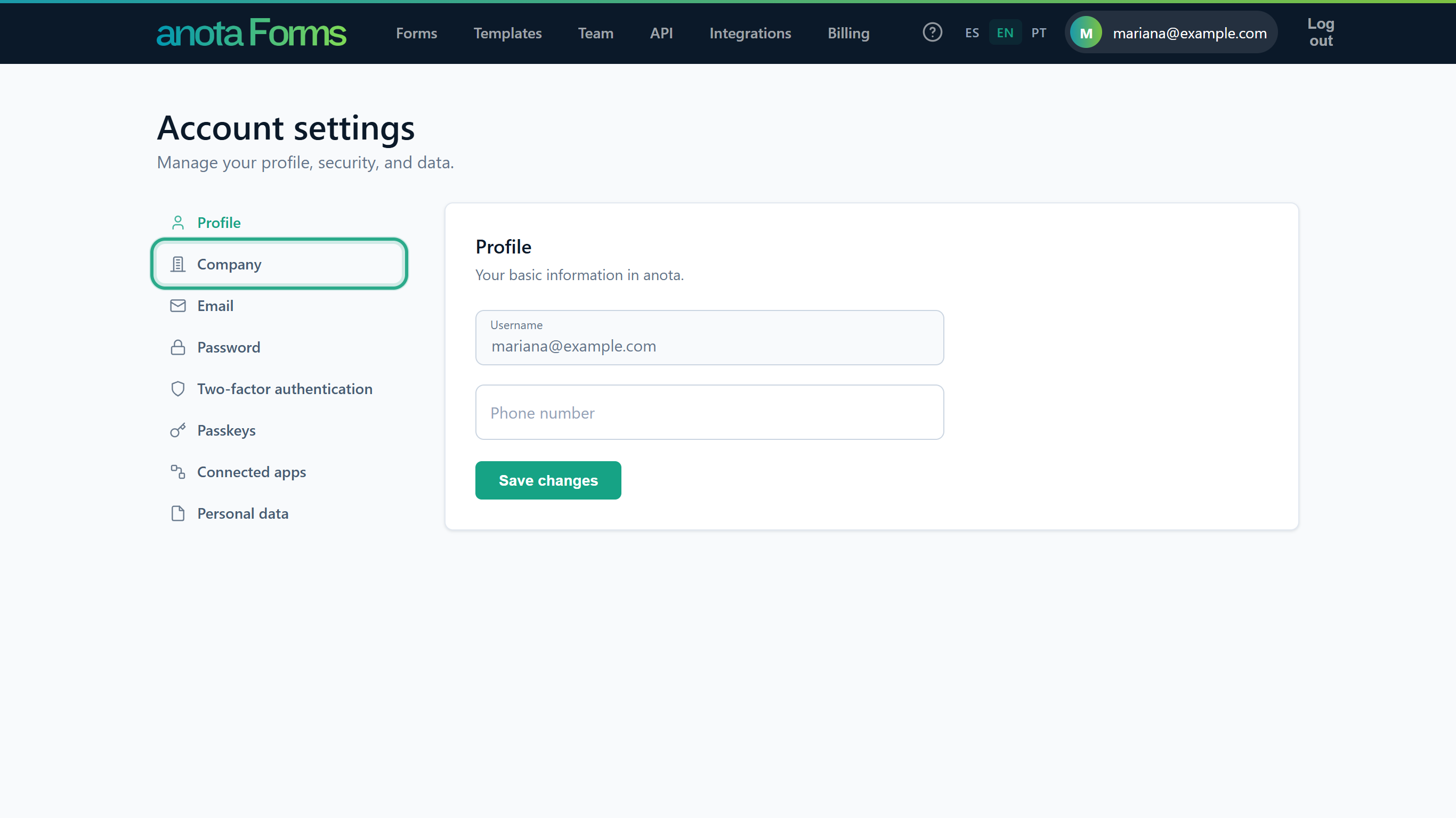 The Company name and logo live on the Company page.
Under Company logo, click Choose File and select your logo. Then click Upload logo. (The Company name above is what appears under the logo on your forms; change it there and click Save if you need to.)
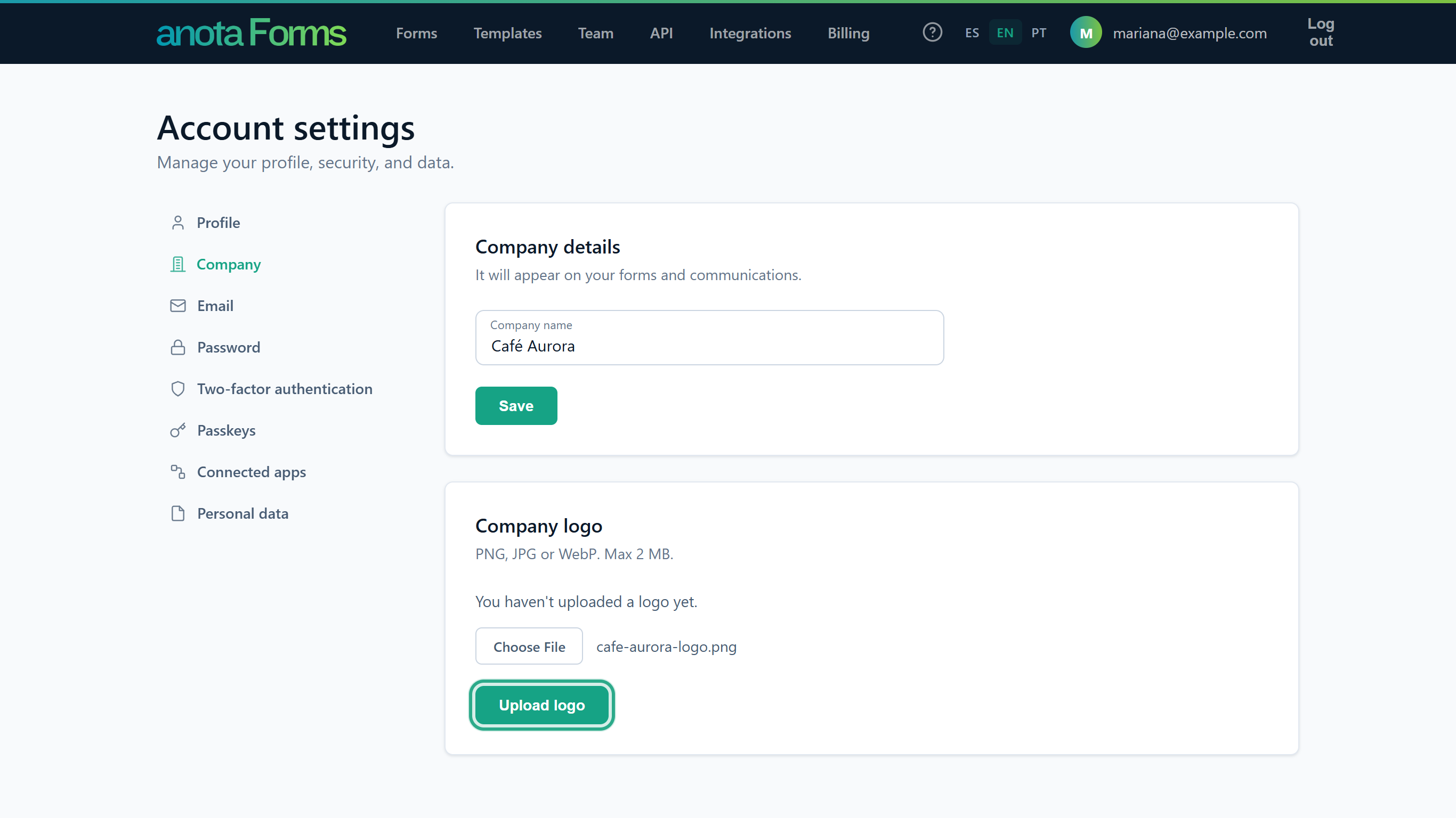 Choose the file, then click Upload logo.
anota shows Logo updated. and the new logo appears under Company logo. Use Remove logo if you ever want to take it off.
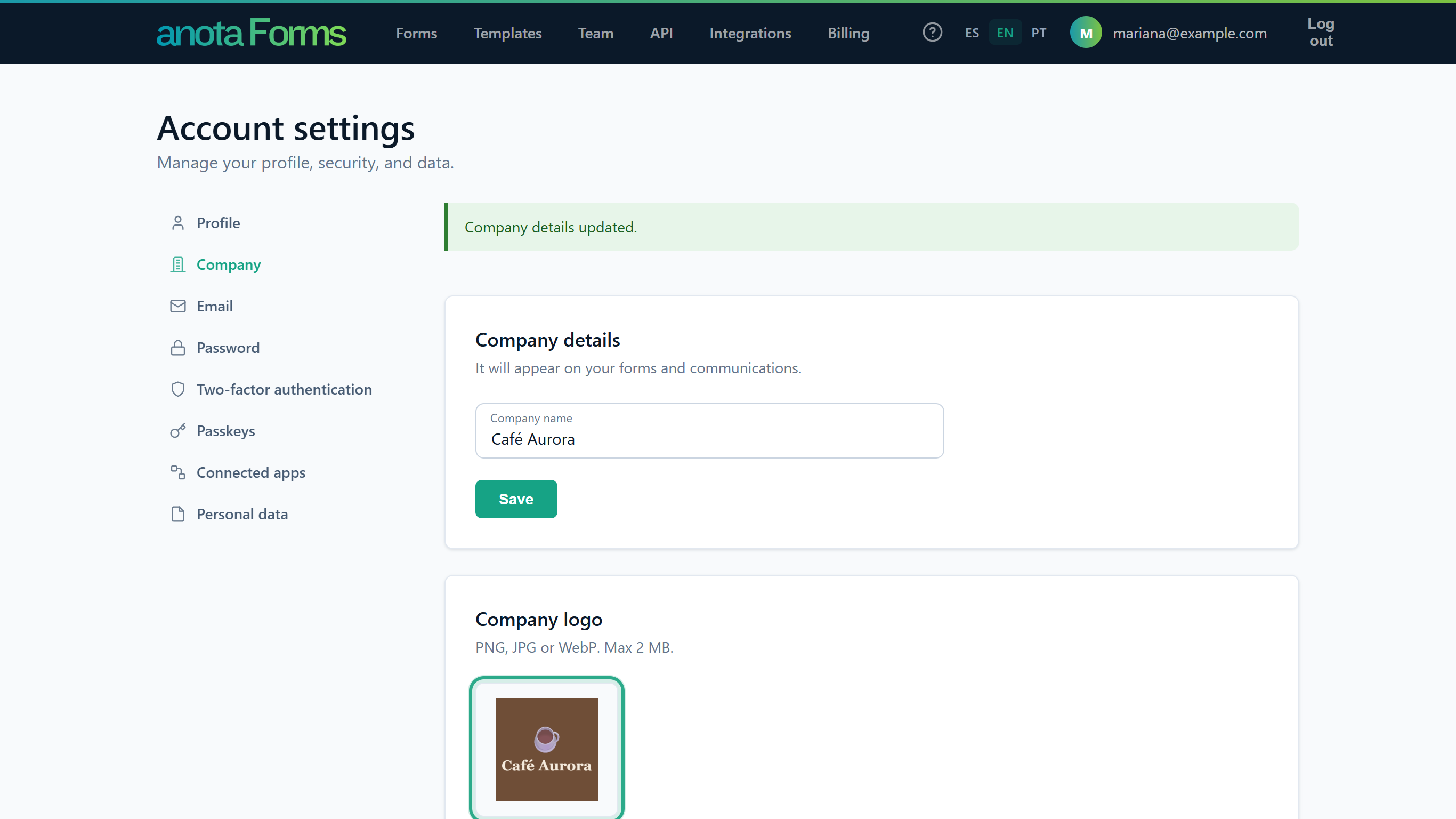 The company logo is saved for the whole workspace.
Go back to your form and open the Designer panel. Scroll to the bottom: the preview box shows the logo and company name the published form will use, with the note "This field is empty, so your company logo (Account > Company) is used instead."
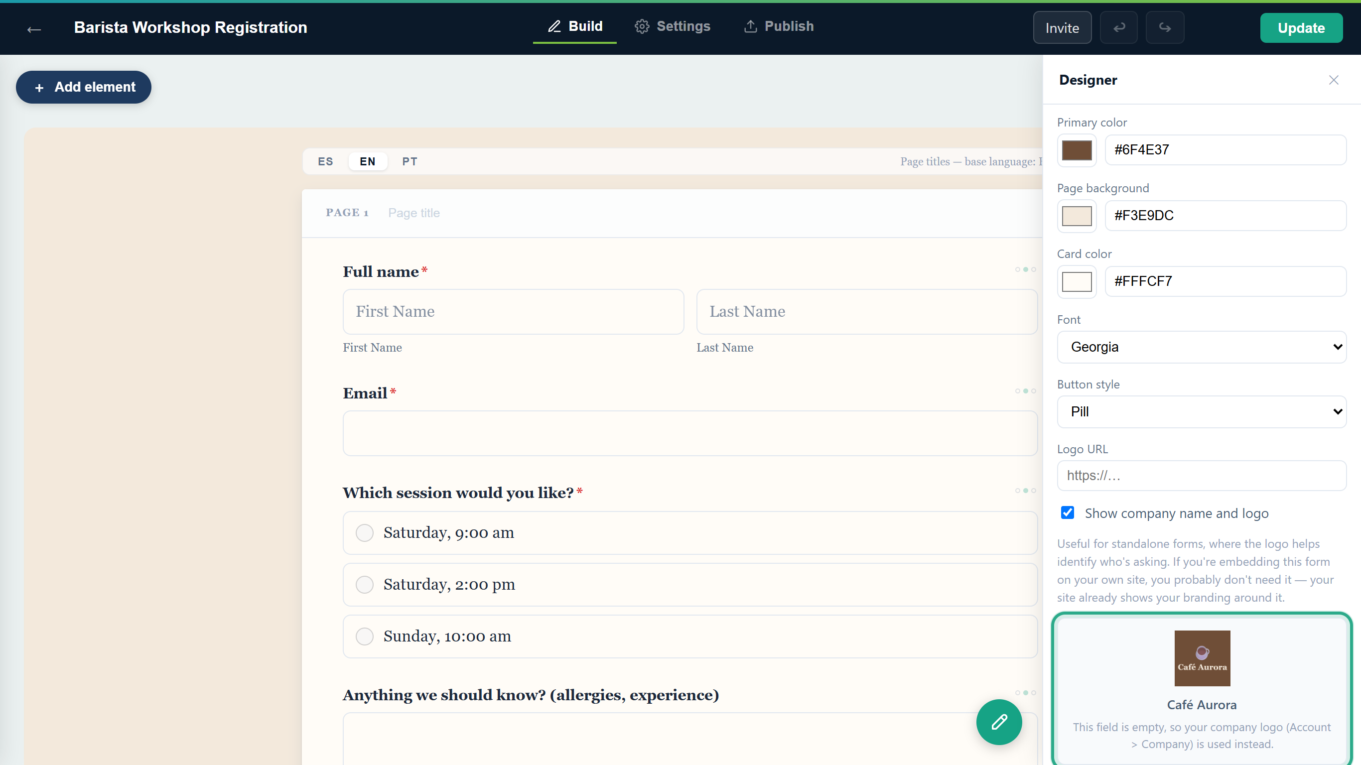 The preview box shows the logo and name without you having to publish first.
A different logo for one form: to use a different logo on one form only, type the image's web address in Logo URL in that form's Designer panel. It replaces the company logo on that form; the company name still shows under it. The preview box then reads "This is how it will look on the published form." Clear the field to go back to the company logo.
Result
Every published form in the workspace that has no Logo URL of its own shows the Café Aurora logo and name at the top straight away. The company logo doesn't need an Update; only the form's own settings do.
Task 7 — Show or hide the Company name and logo
Step-by-step
In the Designer panel, untick Show Company name and logo to leave them off this form. The preview box changes to "Hidden — the published form won't show a logo or company name." This is useful when you embed the form on your own website, which already shows your brand. Tick the box again to show them. It's ticked by default. For the café's form, leave it ticked.
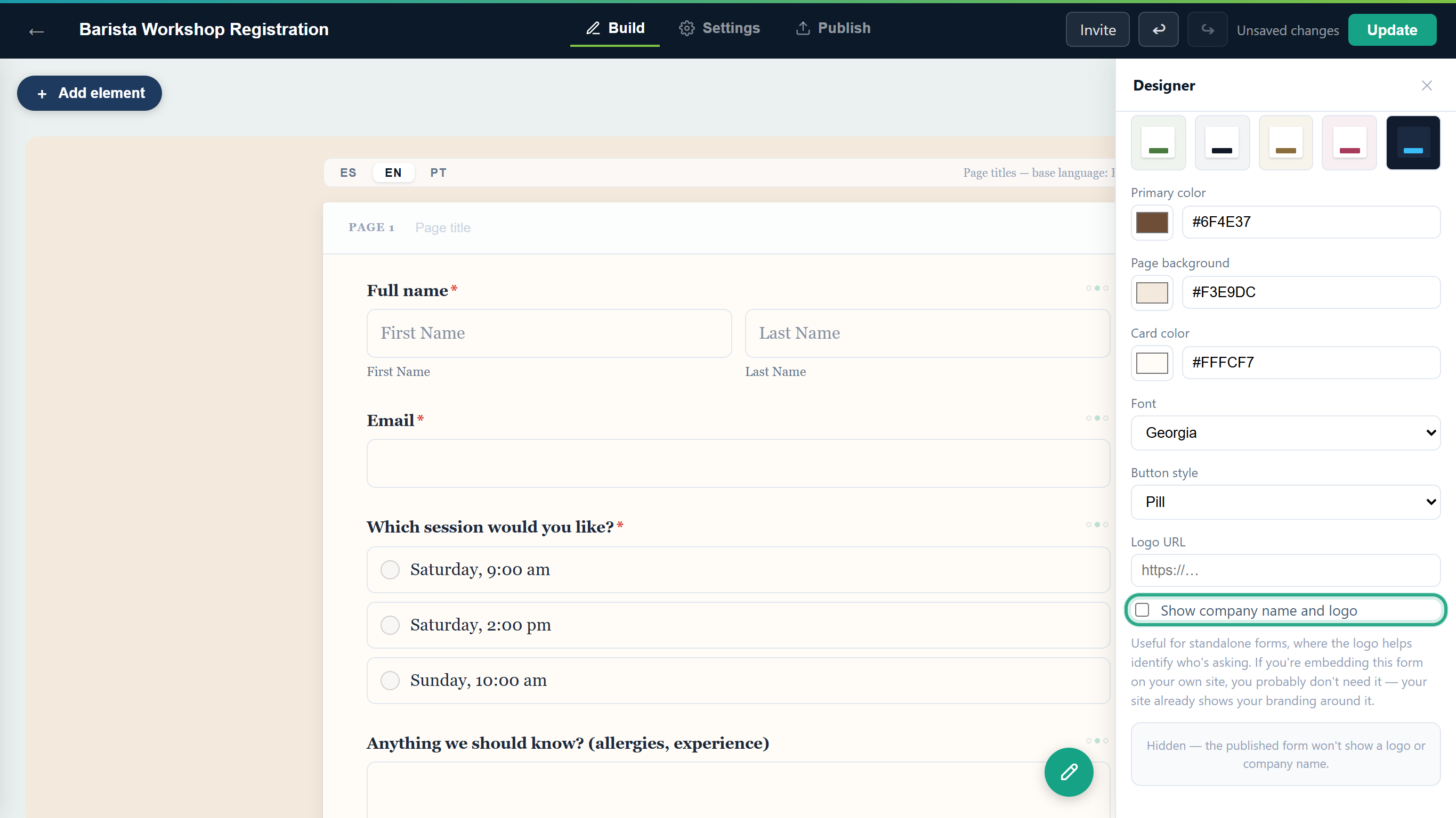 Unticked: the published form won't show the logo or the company name.
Result
The setting applies to this form only; other forms keep their own setting.
Task 8 — Publish the new look and check it
Step-by-step
Click Update at the top right (Publish if the form has never been published). Until you do, visitors still see the old look.
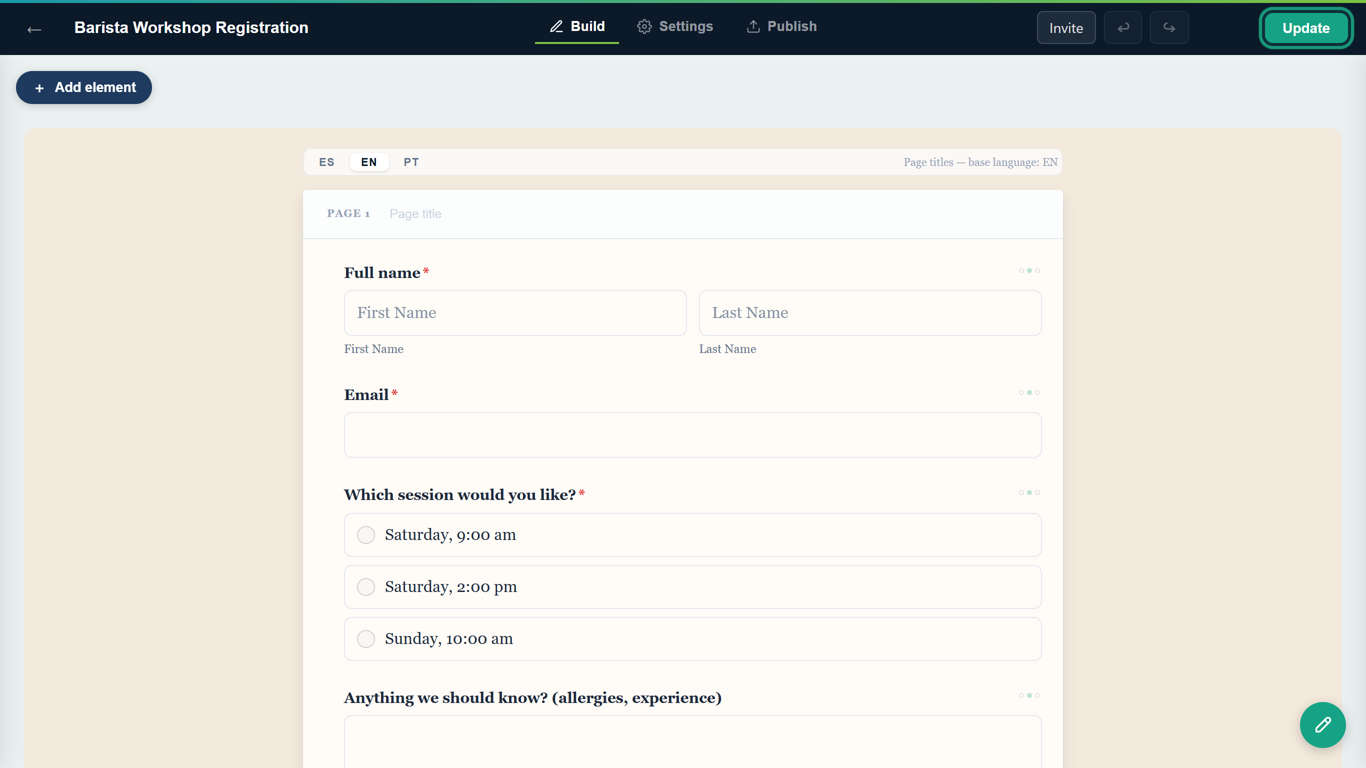 Theme changes go live when you click Update.
anota publishes the change and opens the Publish tab, where the form shows Published.
Open the public link again. The form now has the cream background, the warm card, the Georgia font, and the Café Aurora logo and name at the top.
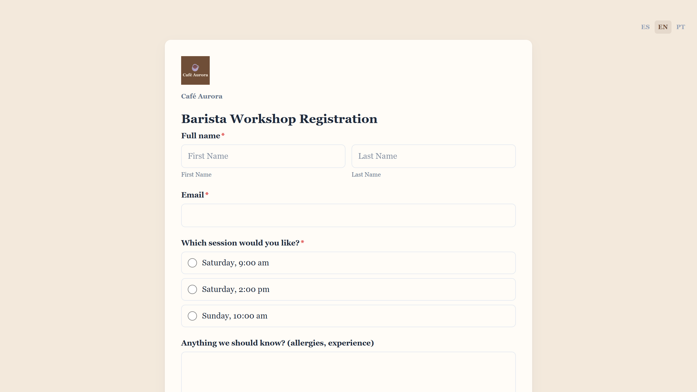 After: the same form with Café Aurora's look.
Scroll to the end of the form. The Submit button uses the coffee-brown primary color and the Pill shape.
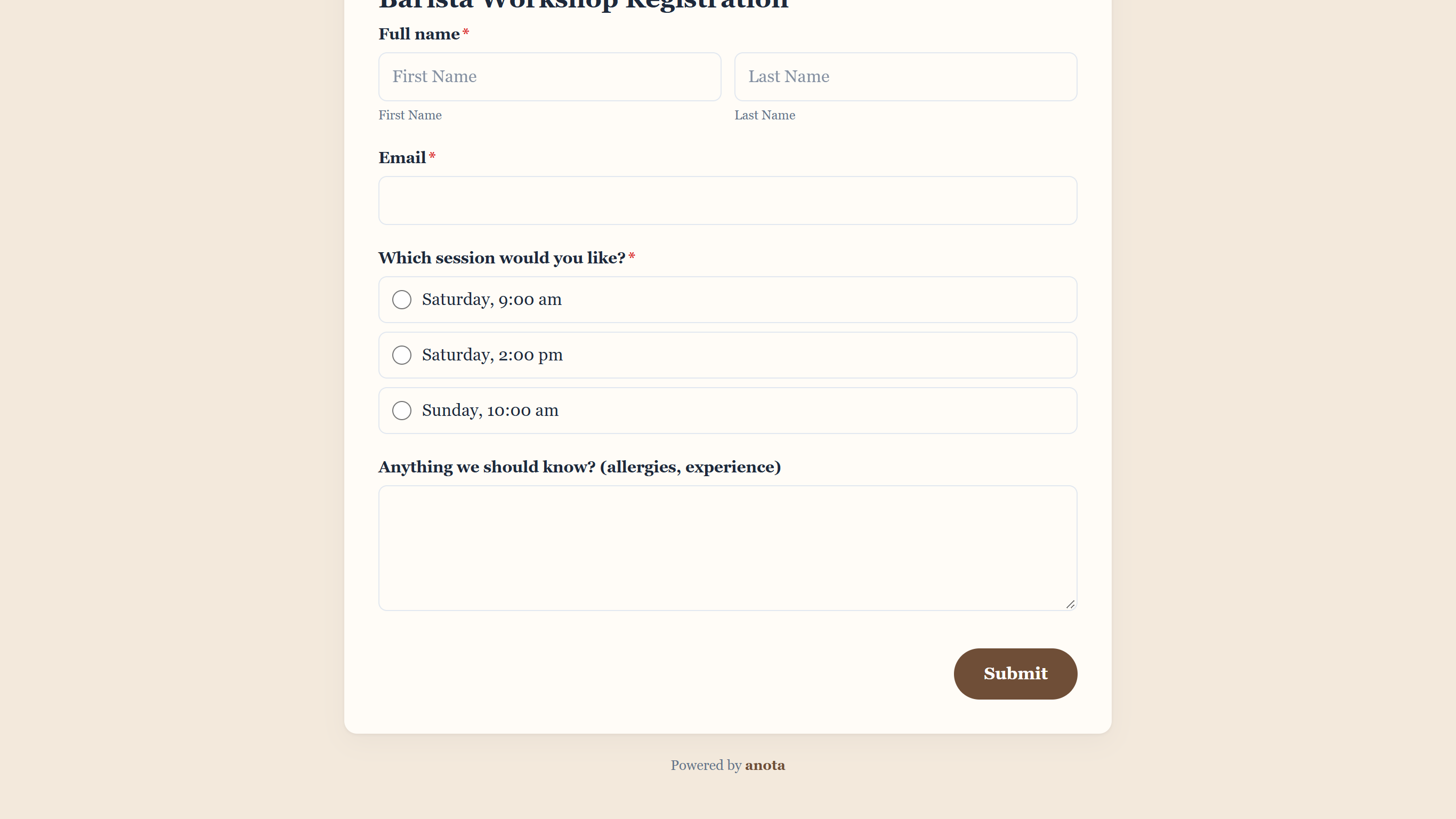 The primary color and the button style show on the Submit button.
Result
Respondents see your theme on the form. The logo and company name also appear on the thank-you screen after they submit.
Task 9 — Change the form's texts
The texts respondents read on the submit button, on the thank-you screen and on a closed form are on the Settings tab, not in the Designer panel.
Step-by-step
Open the Settings tab and choose Form settings. In Submit button text, type the label for the button that sends the form. If you leave it empty, the button reads "Submit" (or its equivalent in the respondent's language). Below it:
- Closed-form message: shown instead of the form once it stops accepting responses, after its Close on date or while it's disabled. If you leave it empty, the form shows "This form is no longer accepting responses."
- Close on date: when the form stops accepting responses, in your browser's time zone (shown under the field). Once a date is set, Remove closing date appears; click it to keep the form open.
- Hidden field values: what happens to answers in fields hidden by a conditional logic rule: Clear at submit (recommended) (the default) drops them; Keep stores them anyway.
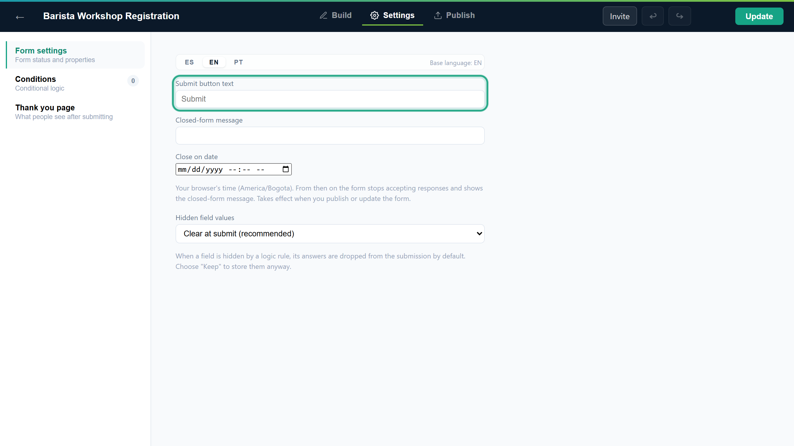 The Form settings section of the Settings tab.
Choose Thank you page and write the Thank-you message respondents see after submitting. If you leave it empty, they see "Thank you! Your submission has been received." To show a different message or send people to another page depending on their answers, click Go to Conditions → and use the Show thank-you message and Redirect to URL actions.
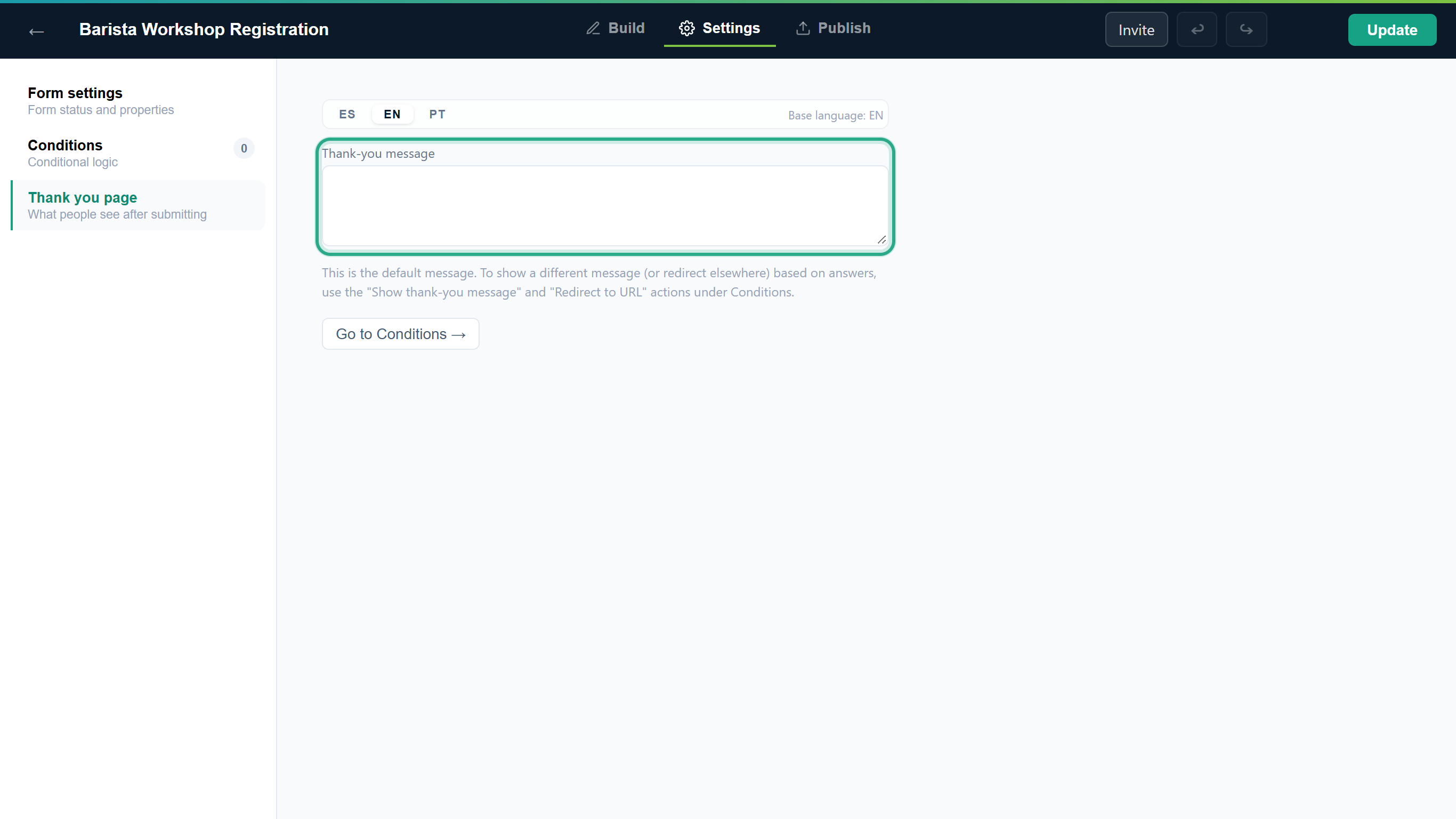 The Thank you page section.
If the form is available in more than one language, click ES, EN or PT above the texts and write each language's version. A text you leave empty falls back to the base language, shown as Base language: on the right.
Result
The new texts go live, like the theme, when you click Update.
Field reference
| Field | Where | Description |
|---|---|---|
| Palettes | Designer panel | Applies a ready-made primary, page background and card color in one click. |
| Primary color | Designer panel | Accent for buttons, links and highlights. Color picker or hex code. |
| Page background | Designer panel | Color around the form card. |
| Card color | Designer panel | Background of the card that holds the questions. |
| Font | Designer panel | Inter (default), system-ui, Georgia, Roboto Slab, Poppins or Courier New. Inter, Roboto Slab and Poppins are loaded as web fonts; the others use the visitor's system fonts. |
| Button style | Designer panel | Rounded (default), Pill or Square. |
| Logo URL | Designer panel | Web address of a logo for this form only. When empty, the company logo is used. |
| Show Company name and logo | Designer panel | Ticked by default. Untick to hide the logo and company name on this form. |
| Company name | Account settings > Company | Shown under the logo on every form. Owner or Admin only. |
| Company logo | Account settings > Company | PNG, JPG or WebP, up to 2 MB. Used by every form without its own Logo URL. Owner or Admin only. |
| Submit button text | Settings > Form settings | Label of the submit button. Translatable. |
| Closed-form message | Settings > Form settings | Shown after the closing date or while the form is disabled. Translatable. |
| Close on date | Settings > Form settings | When the form stops accepting responses, in your browser's time zone. |
| Hidden field values | Settings > Form settings | Clear at submit (recommended) (default) or Keep. |
| Thank-you message | Settings > Thank you page | Shown after a successful submission. Translatable. |
Roles and permissions
| Role | Change a form's theme and texts | Set the Company name and logo |
|---|---|---|
| Owner | Yes | Yes |
| Admin | Yes | Yes |
| Editor | Yes | No |
| Viewer | No | No |
For the full permission matrix, see Roles and permissions.
Troubleshooting
| Symptom | Likely cause | Resolution |
|---|---|---|
| The new colors show in the builder but not on the public form. | Theme changes stay in the draft until you publish. | Click Update in the editor's top bar. |
| I can't find the colors on the Settings tab. | The theme isn't on Settings. | On the Build tab, click the ✏ Design button at the bottom right. |
| The company logo doesn't appear on a published form. | The form has its own Logo URL, or Show Company name and logo is unticked. | Check the preview box at the bottom of the Designer panel, fix the setting, and click Update. |
| I changed the company logo, but one form shows a different one. | That form has its own Logo URL, which takes priority. | Clear or change that form's Logo URL. |
| Upload logo shows "Error: Unsupported format. Use PNG, JPG or WebP." | The file isn't a PNG, JPG or WebP image. | Save the logo in one of those formats and upload it again. |
| Upload logo shows "Error: The file exceeds the 2 MB limit." | The image is too large. | Use a smaller version of the logo. |
| I can't open the Company page, or I can't save it. | Only Owners and Admins can change the company details. | Ask an Owner or Admin of the workspace. |
| I'd like to add my own CSS. | The Designer panel has no custom CSS option. | Use the palette, colors, font and button style. |
Related features
- The form editor
- Company name and logo
- Publish and share
- Multilingual forms
- Conditional logic: rules that can hide fields; Hidden field values controls what happens to their answers.
- Export to PDF: PDF Templates use the form's primary color as their accent.
- Roles and permissions
Was this page helpful?