 P4 Software
/
logisticaHQ-en
P4 Software
/
logisticaHQ-en
P4 Software
/
logisticaHQ-en
P4 Software
/
logisticaHQ-en
A widget is one report: a query that reads your data, and one or more ways to show its rows (a chart, a grid, tiles, a single number, a gauge). Widgets are the building blocks of dashboards: a dashboard is a board of widgets, each in its own panel. The same widget can sit on several dashboards.
Open Setup > Reporting > Widgets. Only office users can create and change widgets.
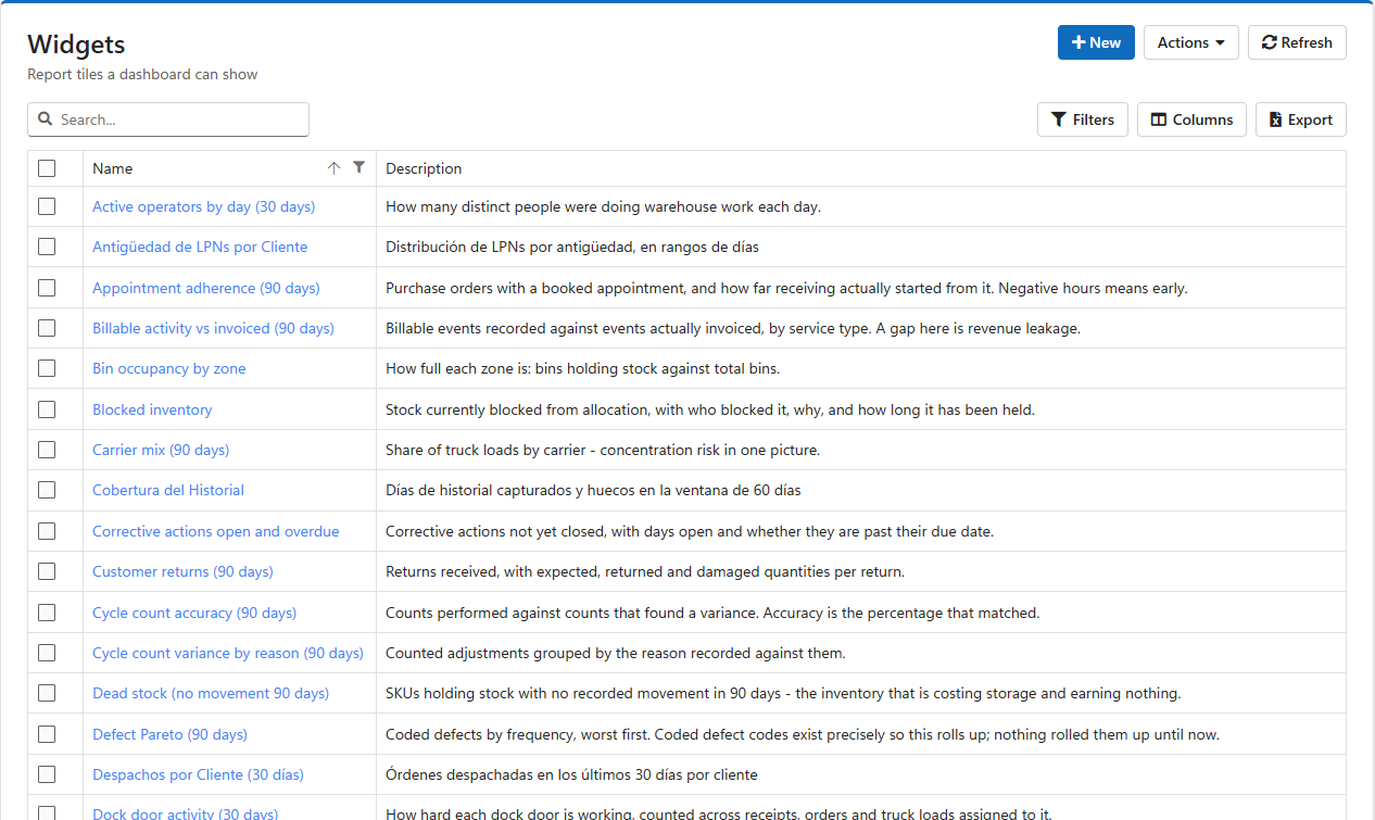
Each row is one widget, with its Name, Description and Created date. Double-click a row to open it.
| Button | What it does |
|---|---|
| New | Asks for a name and a description, creates the widget and opens it. |
| Actions > Refresh | Reads the list again. |
| Actions > Delete | Removes the ticked widgets after you confirm. A widget still placed on a dashboard leaves an empty panel there. |
| Actions > Export | Downloads the ticked widgets as a file, query and presentations included, to copy them to another LogisticaHQ company. |
| Actions > Import | Loads widgets from an exported file. |
To start from a complete set of ready-made widgets and a Warehouse performance dashboard instead, use Seed default reports on the Dashboards list.
The widget screen has a General tab, then one tab per presentation, then a + to add a presentation. Update saves the widget, the query and every presentation together; Refresh reads it again and drops unsaved changes.
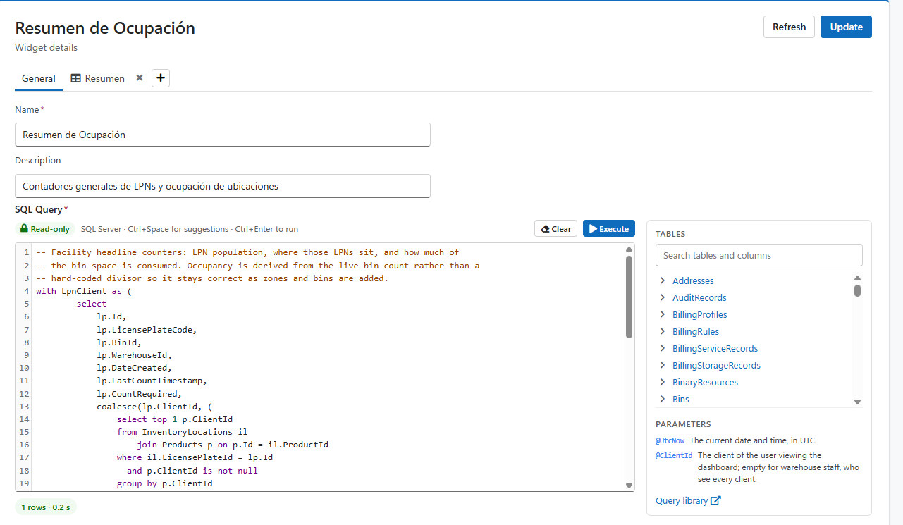
| Field | What it is |
|---|---|
| Name (required) | The widget's name, as the dashboard designer lists it. |
| Description | What the widget shows. |
| SQL Query (required) | The query whose rows the presentations show. |
The query is written in LogisticaHQ's SQL editor, the same one as the Query builder and Scheduled reports: it can only read (a single SELECT, run on a read-only login, never passwords or API keys), colours SQL as you type, suggests tables after FROM and columns in the SELECT list (Ctrl+Space), and lists every table and column on the right. Click a name there to insert it at the cursor.
Execute (or Ctrl+Enter) runs the query and shows the rows under the editor in a Result card, with its own search, filters, columns and Excel export. The × on the card closes it. Look at the result before you set up a presentation: the presentations refer to its column names.
| Write in the query | Replaced with, when a dashboard shows the widget |
|---|---|
@ClientId | The client of the person viewing the dashboard. It is empty for warehouse staff, who see every client, so filter with (@ClientId IS NULL OR p.ClientId = @ClientId) and one widget serves both. |
@UtcNow | The current date and time, in UTC. |
@{Label} | A filter: a value typed per dashboard panel, in the panel's options. @{Warehouse} is a text box, @{Days:number} a number box, @{From:date} a date picker; the part before the colon is the label people see. |
A filter's value is placed in the query as typed, so put text filters in quotes: WHERE w.WarehouseCode = '@{Warehouse}'; numbers and dates go without: WHERE DATEDIFF(day, pt.ShippedDate, GETDATE()) <= @{Days:number}. With the same widget on two panels, each panel keeps its own values, so one widget can show warehouse 1001 on one panel and 1002 on another.
A presentation is one way of showing the query's rows. A widget can have several, for example a chart and a grid of the same numbers; each dashboard panel picks the one it shows. Click + and choose the kind:
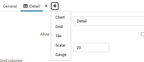
Each presentation gets a tab. Its arrows move it left or right among the tabs, and its × removes it. Every presentation has a Name (required), which is what the dashboard designer offers when you pick a presentation for a panel.
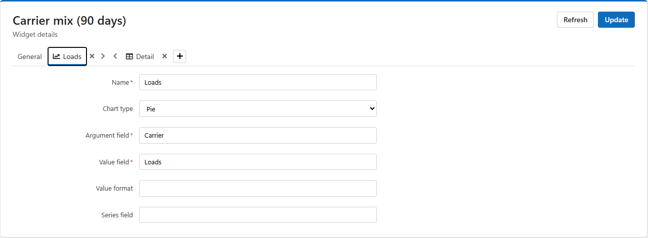
| Field | What it is |
|---|---|
| Chart type | Area, Bar (horizontal), Column (vertical), Line or Pie. |
| Argument field (required) | The column along the axis: dates, SKUs, operators. Type the column name exactly as the result shows it. |
| Value field (required) | The column that gives each point or slice its size. |
| Value format (Pie only) | How slice values are written, for example n0 for whole numbers or p1 for a percentage with one decimal. |
| Series field | Optional. A column that splits the chart into one line or bar colour per value, for example one line per client. |
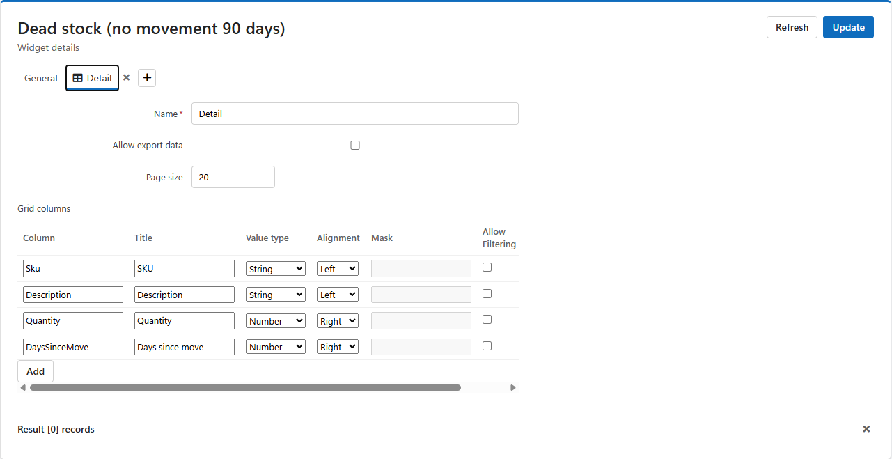
| Field | What it is |
|---|---|
| Allow export data | Gives the grid on the dashboard its toolbar: search, filters, column chooser and Export to Excel. Without it the grid shows the rows only. |
| Page size | How many rows show per page; 20 when left empty. |
| Grid columns | The columns the grid shows, in order. Add adds one; the arrows move a column up or down; × removes it. List every column you want people to see. |
Each column has:
| Field | What it is |
|---|---|
| Column | The query column it shows. |
| Title | The heading people see. |
| Value type | Number, Currency, Percentage, String, Date, DateTime, Boolean or Link. It decides how values are written and sorted. |
| Alignment | Left, Center or Right. |
| Mask (Link only) | The screen the value opens, with @{Column} wherever a value of the row goes, for example pickTicketDetails/@{Id} to open the order whose Id is in the row's Id column. Write only the screen's path; LogisticaHQ adds the rest of the address. |
| Allow Filtering | Shows a filter for the column. |
Tiles show each row of the query as a coloured card, which suits a short list such as one card per warehouse or per zone.
| Field | What it is |
|---|---|
| Background Color Column | Optional. A query column holding a colour (for example #2e7d32) that colours each tile by its own row, so the query can make late orders red and on-time ones green. |
| Tile Width, Tile Height | The size of each tile, in pixels. |
| Grid columns | The lines on each tile, with the same Column, Title, Value type and Alignment as a grid, plus Text Color, Background Color and Bold for each line. |
A single number in large type: the value in the first column of the first row. Write the query so it returns exactly that, for example SELECT COUNT(*) FROM PickTickets WHERE ShippedDate IS NULL. A scalar has only its Name.
A dial or bar showing one value against a scale; like the scalar, it reads the first column of the first row.
| Field | What it is |
|---|---|
| Gauge type | Circular (a dial) or Linear (a bar). |
| Orientation (Linear only) | Horizontal or Vertical. |
| Format | How the value is written. |
| Start value, End value | The two ends of the scale. |
| Tick Interval | The distance between the marks on the scale. |
| Ranges | Coloured bands on the scale, each with a Start value, an End value and a Color, for example red from 0 to 80, amber to 95, green to 100. Add adds a band; × removes one. |
SELECT CAST(pt.ShippedDate AS date) AS [Day],
       COUNT(*) AS [Orders]
FROM PickTickets pt
WHERE pt.ShippedDate >= DATEADD(day, -30, GETDATE())
  AND (@ClientId IS NULL OR pt.ClientId = @ClientId)
GROUP BY CAST(pt.ShippedDate AS date)
ORDER BY [Day]Day and Value field to Orders.| What you see | Why, and what to do |
|---|---|
| The chart is empty on the dashboard | The Argument or Value field does not match a column name of the result exactly. Press Execute and copy the name from the result's heading. |
| A client user sees every client's numbers | The query does not filter on @ClientId. Add (@ClientId IS NULL OR x.ClientId = @ClientId) to its WHERE. |
| Execute says the query was refused | It is not a single read-only SELECT, or reads protected data. The message says which. |
| A filter shows no box on the panel | Its placeholder is misspelt. Write it as @{Label}, @{Label:number} or @{Label:date}, then open the panel's options again. |
Was this page helpful?